Archive

Archive for the ‘WPF Controls’ Category

WPF Ribbon: RibbonCommands Can Cause Memory Leaks

April 15th, 2009

I stumbled over an issue when dealing with Microsoft’s WPF ribbon today. Apparently, the control that heavily relies on RibbonCommands rather than arbitrary ICommand instances may cause severe memory leaks. Have a look at this simple Window:


<Window ...>
  <Grid>
    <Grid.Resources>
      <r:RibbonCommand
        x:Key="MyCommand"
        Executed="OnRibbonClicked"
        LabelTitle="Click Me" />
    </Grid.Resources>

    <!-- a ribbon that only displays a command in the quick access toolbar -->
    <r:Ribbon>
      <r:Ribbon.QuickAccessToolBar>
        <r:RibbonQuickAccessToolBar>
          <r:RibbonButton
            Command="{StaticResource MyCommand}"
            r:RibbonQuickAccessToolBar.Placement="InToolBar" />
        </r:RibbonQuickAccessToolBar>
      </r:Ribbon.QuickAccessToolBar>
    </r:Ribbon>
  </Grid>
</Window>


…and here’s the event listener that was declared for the RibbonCommand:

private void OnRibbonClicked(object sender, ExecutedRoutedEventArgs e)
{
  MessageBox.Show("Ribbon command executing.");
}


Once opened and closed, this window will not be garbage collected until the application shuts down. The reason is the OnRibbonClicked event handler that doesn’t get deregistered.

There are signs that Microsoft will dump RibbonCommand completely once the ribbon goes live. However: This probably won’t happen too fast, so you will have to solve the issue on your own. On the bright side: It forces a cleaner design on you.

I prefer custom commands anyway, so the natural way to go was to simply implement my own class that derives from RibbonCommand:


///<summary>
/// Base class for custom <see cref="RibbonCommand"/>
/// implementations.
///</summary>
public abstract class RibbonCommandBase : RibbonCommand
{
  /// <summary>
  /// Creates the command and registers weak event listeners.
  /// </summary>
  protected RibbonCommandBase()
  {
    Executed += OnExecute;
    CanExecute += OnCanExecute;
  }

  /// <summary>
  /// Determines whether the command can be executed or not.
  /// The default implementation always allows that.
  /// </summary>
  protected virtual void OnCanExecute(object sender, CanExecuteRoutedEventArgs e)
  {
    e.CanExecute = true;
  }

  /// <summary>
  /// Command implementation - executes command logic.
  /// </summary>
  protected abstract void OnExecute(object sender, ExecutedRoutedEventArgs e);
}


The noteworthy thing here is that this abstract base class registers event listeners for its own events - one virtual, one abstract. Accordingly, a deriving command implementation only has to provide its own OnExecute and OnCanExecute (optional) methods to get going:


public class MessageCommand : RibbonCommandBase
{
  protected override void OnExecute(object sender, ExecutedRoutedEventArgs e)
  {
    MessageBox.Show("Ribbon command executing.");
  }
}


The last thing to correct is the command declaration in XAML - rather than declaring a RibbonCommand with a code-behind event listener, you declare your custom command (MessageCommand in the sample below). As you can see, there is no longer a listener for the Executed event - the command takes care of this on its own. Accordingly, this command can be declared in a resource dictionary without a code-behind file.

<!-- Custom command - can be declared in a resource dictionary -->
<cmd:MessageCommand x:Key="MyCommand"
                    LabelTitle="Click Me"
                    SmallImageSource="About.png"
/>


Sample Project

The attached sample project shows the two variants and the missing garbage collection of the standard ribbon commands.

I wasn’t sure about licensing restrictions, therefore I did not include the WPF ribbon assembly in the downloadable sample - you’ll have to add the reference yourself before compiling. Sorry for the inconvenience :/

Download: ribbon-commands.zip


 image


kick it on DotNetKicks.com

Tags: ,

WPF NotifyIcon - Release Candidate

April 1st, 2009

This is an implementation of a NotifyIcon (aka system tray icon or taskbar icon) for the WPF platform.

image

Update:

The control has now its own project page. Please go to

http://www.hardcodet.net/projects/wpf-notifyicon

Moving WPF DataGrid Rows using Drag and Drop

March 24th, 2009

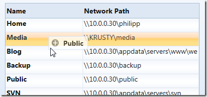
For my upcoming NetDrives tool (will be released shortly) I wanted to enable the user to reorder managed network shares using drag and drop using a preview of the dragged row:

image


As it turned out, it’s not too hard to implement, but it took my a while to find all pieces of the puzzle, so I compiled a short sample. You can find the sample link at the end of the article.


Drag Indicator Popup

I used a popup as an drag indicator, which I bound to the item that was currently dragged (DraggedItem dependency property):

<!-- the popup that is displayed if user moves rows -->
<Popup
  x:Name="popup1"
  IsHitTestVisible="False"
  Placement="RelativePoint"
  PlacementTarget="{Binding ElementName=me}"
  AllowsTransparency="True">
  <Border
    BorderBrush="{DynamicResource CellBorderBrush}"
    BorderThickness="2"
    Background="White"
    Opacity="0.75">
    <StackPanel
      Orientation="Horizontal"
      Margin="4,3,8,3">
      <Image
        Source="/Shared/Images/DragInsert.png"
        Width="16"
        Height="16" />
      <TextBlock
        Style="{DynamicResource DefaultLabel}"
        FontWeight="Bold"
        VerticalAlignment="Center"
        Text="{Binding ElementName=me, Path=DraggedItem.Name}"
        Margin="8,0,0,0" />
    </StackPanel>
  </Border>
</Popup>


Disabling Drag and Drop in Edit Mode

I didn’t want to enable drag and drop if the grid was in edit mode. Accordingly, I registered two event listeners on the grid:

<dg:DataGrid
  BeginningEdit="OnBeginEdit"
  CellEditEnding="OnEndEdit"
  .. />


The corresponding event listeners just set the IsEditing flag, which is evaluated when handling mouse events:

/// <summary>
/// State flag which indicates whether the grid is in edit
/// mode or not.
/// </summary>
public bool IsEditing { get; set; }

private void OnBeginEdit(object sender, DataGridBeginningEditEventArgs e)
{
  IsEditing = true;
  //in case we are in the middle of a drag/drop operation, cancel it...
  if (IsDragging) ResetDragDrop();
}

private void OnEndEdit(object sender, DataGridCellEditEndingEventArgs e)
{
  IsEditing = false;
}


Listening to Mouse Events

In order to display and move the popup with the mouse, I registered listeners for the following three mouse events:

  • PreviewMouseLeftButtonDown (on the datagrid)
  • MouseLeftButtonUp (directly on the layout root)
  • MouseMove (directly on the layout root)


Note: I started with listeners on the grid only, which caused some side effects. Apparently, the datagrid (current March release) not always fires the mouse events properly. This caused choppy animations when hovering over certain cells. Fortunately, this is not an issue with the MouseMove event of the layout root.


Starting Drag and Drop

DnD is started as soon as the user presses the left mouse button on the datagrid. I had to use the PreviewLeftMouseButton event in order to get the notification, and I needed to determine the clicked row based on the mouse position. I blogged about finding an element under the mouse a while ago here, but the UIHelpers class is part of the sample project here.

My mouse button event listener basically does the following:

  • Check if the mouse is being placed over a grid row.
  • Set the IsDragging flag to true.
  • Store the dragged item in the DraggedItem dependency property (used by the popup to display the name).


private void OnMouseLeftButtonDown(object sender, MouseButtonEventArgs e)
{
  //exit if in edit mode
  if (IsEditing) return;

  //find the clicked row
  var row = UIHelpers.TryFindFromPoint<DataGridRow>((UIElement) sender,
                                                    e.GetPosition(shareGrid));
  if (row == null) return;

  //set flag that indicates we're capturing mouse movements
  IsDragging = true;
  DraggedItem = (IShareConfiguration) row.Item;
}


Moving the Popup

I registered a listener for the MouseMove event directly on the layout root (not on the datagrid). Basically, the event listener just moves the popup to the current mouse location along with a few minor tasks:

  • If the popup has not been opened yet, display it.
  • Set the grid to read-only.
  • Reposition the popup by setting the PlacementRectangle property.
  • Make sure the grid row under the mouse is being selected. Once again, this didn’t work reliably if I relied on the datagrid to do it by itself.


/// <summary>
/// Completes a drag/drop operation.
/// </summary>
private void OnMouseLeftButtonUp(object sender, MouseButtonEventArgs e)
{
  if (!IsDragging || IsEditing)
  {
    return;
  }

  //get the target item
  ShareConfiguration targetItem = (ShareConfiguration) shareGrid.SelectedItem;

  if (targetItem == null || !ReferenceEquals(DraggedItem, targetItem))
  {
    //remove the source from the list
    ShareList.Remove(DraggedItem);

    //get target index
    var targetIndex = ShareList.IndexOf(targetItem);

    //move source at the target's location
    ShareList.Insert(targetIndex, DraggedItem);

    //select the dropped item
    shareGrid.SelectedItem = DraggedItem;
  }

  //reset
  ResetDragDrop();
}


Finishing Drag and Drop

Once the user releases the mouse button, I need to perform the actual drop operation. I already had the dragged item (DraggedItem property, was set when the operation started) so all I needed was the drop target. My target is the currently selected row.

/// <summary>
/// Completes a drag/drop operation.
/// </summary>
private void OnMouseLeftButtonUp(object sender, MouseButtonEventArgs e)
{
  if (!IsDragging || IsEditing || shareGrid.SelectedItem == null)
  {
    return;
  }

  //get the target item
  IShareConfiguration targetItem = (IShareConfiguration)shareGrid.SelectedItem;

  if (!ReferenceEquals(DraggedItem, targetItem))
  {
    //the actual business logic that works on source and target
  }

  //reset
  ResetDragDrop();
}


You might also want to check whether the mouse is currently over the grid (or a grid row) or not - in that case just use the TryFindFromPoint method from the UIHelpers class.


Cleaning Up

The ResetDragDrop method just performs a cleanup of the code by closing the popup and adjusting a few properties:

/// <summary>
/// Closes the popup and resets the
/// grid to read-enabled mode.
/// </summary>
private void ResetDragDrop()
{
  IsDragging = false;
  popup1.IsOpen = false;
  shareGrid.IsReadOnly = false;
}


Download Sample: http://www.hardcodet.net/uploads/2009/03/datagrid_dragdrop.zip

Tags: ,

Detecting Double Click Events on the WPF DataGrid

March 21st, 2009

Either I missed the obvious solution, or there is indeed no simple way to catch double click events on a given row of Microsoft’s WPF DataGrid.

This snippet here fires the event whenever the grid is clicked - it doesn’t matter whether the user double-clicks into an empty area (no rows) or a row:

<!-- fires even if the user does not click a given row -->
<dg:DataGrid
  dg:DataGridRow.MouseDoubleClick="OnDoubleClick" />


As a result, I reverted to a workaround by searching the Visual Tree of the event source for an instance of type DataGridRow. In order to find the ancestor item, I used a snippet I posted here a while ago. Here’s the full code:


XAML:

<!-- just register a listener on the grid -->
<dg:DataGrid
  MouseDoubleClick="OnDoubleClick" />


Code-Behind:

/// <summary>
/// Handles double-clicks on datagrid rows.
/// </summary>
private void OnDoubleClick(object sender, MouseButtonEventArgs e)
{
  //search the object hierarchy for a datagrid row
  DependencyObject source = (DependencyObject) e.OriginalSource;
  var row = UIHelpers.TryFindParent<DataGridRow>(source);

  //the user did not click on a row
  if (row == null) return;

  //[insert great code here...]

  e.Handled = true;
}


UIHelper class providing the TryFindParent method:

(Snippet updated: 2009.09.14)

/// <summary>
/// Finds a parent of a given item on the visual tree.
/// </summary>
/// <typeparam name="T">The type of the queried item.</typeparam>
/// <param name="child">A direct or indirect child of the
/// queried item.</param>
/// <returns>The first parent item that matches the submitted
/// type parameter. If not matching item can be found, a null
/// reference is being returned.</returns>
public static T TryFindParent<T>(this DependencyObject child)                               where T : DependencyObject
{
  //get parent item
  DependencyObject parentObject = GetParentObject(child);

  //we've reached the end of the tree
  if (parentObject == null) return null;

  //check if the parent matches the type we're looking for
  T parent = parentObject as T;
  if (parent != null)
  {
    return parent;
  }
  else
  {
    //use recursion to proceed with next level
    return TryFindParent<T>(parentObject);
  }
}

/// <summary>
/// This method is an alternative to WPF's
/// <see cref="VisualTreeHelper.GetParent"/> method, which also
/// supports content elements. Keep in mind that for content element,
/// this method falls back to the logical tree of the element!
/// </summary>
/// <param name="child">The item to be processed.</param>
/// <returns>The submitted item's parent, if available. Otherwise
/// null.</returns>
public static DependencyObject GetParentObject(this DependencyObject child)
{
  if (child == null) return null;

  //handle content elements separately
  ContentElement contentElement = child as ContentElement;
  if (contentElement != null)
  {
    DependencyObject parent = ContentOperations.GetParent(contentElement);
    if (parent != null) return parent;

    FrameworkContentElement fce = contentElement as FrameworkContentElement;
    return fce != null ? fce.Parent : null;
  }

  //also try searching for parent in framework elements (such as DockPanel, etc)
  FrameworkElement frameworkElement = child as FrameworkElement;
  if (frameworkElement != null)
  {
    DependencyObject parent = frameworkElement.Parent;
    if (parent != null) return parent;
  }

  //if it's not a ContentElement/FrameworkElement, rely on VisualTreeHelper
  return VisualTreeHelper.GetParent(child);
}


Enjoy :-)

Tags:

ComboBox SelectedItem and ItemsSource: Order Matters

January 14th, 2009

A co-worker of mine had a strange issue with a bound combo box that looked like this: 

<ComboBox
  x:Name="cboParentUser"
  ItemsSource="{Binding Path=Order.Store.Users, ElementName=me, Mode=Default}"
  SelectedItem="{Binding Path=Order.ParentUser, ElementName=me, Mode=Default}"
  IsEditable="False"
  DisplayMemberPath="UserName" />


As we could observe at runtime, selecting an item in the combo box properly updated the underlying ParentUser property. Furthermore, we could easily exchange the data context (Order dependency property) in order to edit different items.

However: As soon a the editor control that contained the combo box was unloaded, the ParentUser property of the currently edited Order was set to null, so all previously made adjustments were lost.

The reason behind this behavior seems to be the fact that both ItemsSource and SelectedItem are bound to the same dependency property: Apparently, when Order is set to null during unloading, WPF realizes that the ItemsSource is no longer valid, and therefore clears the SelectedItem, to which the combo box still appears to hold a reference at this moment - which brings it down to a question of proper coercion. Or maybe not - the reason behind this is not entirely clear to me.

However: Changing the declaration order of SelectedItem and ItemsSource fixes the problem:

<ComboBox
  x:Name="cboParentUser"
  SelectedItem="{Binding Path=Order.ParentUser, ElementName=me, Mode=Default}"
  ItemsSource="{Binding Path=Order.Store.Users, ElementName=me, Mode=Default}"
  IsEditable="False"
  DisplayMemberPath="UserName" />


And yes: This does feel like a dirty hack.

Tags: ,

Using Attached Properties to Create a WPF Image Button

January 7th, 2009

Today I came across a nice blog post that described how to create a WPF image button with three different approaches. I’ve always taken an alternative route using attached properties, so here’s a short tutorial that complement’s the techniques outlined on Max’ Blog:


 image


Basically, the work to get there consists of two parts:

  • Declare an attached property that gets an image source.
  • Create a style (or multiple styles) that makes use of the attached property in order to display the image.


Attached Property

There’s nothing special here - I just declared an attached property named Image, which is of type ImageSource.


using System.Windows;
using System.Windows.Media;

namespace Hardcodet.Wpf.Util
{
  public class EyeCandy
  {
    #region Image dependency property

    /// <summary>
    /// An attached dependency property which provides an
    /// <see cref="ImageSource" /> for arbitrary WPF elements.
    /// </summary>
    public static readonly DependencyProperty ImageProperty;

    /// <summary>
    /// Gets the <see cref="ImageProperty"/> for a given
    /// <see cref="DependencyObject"/>, which provides an
    /// <see cref="ImageSource" /> for arbitrary WPF elements.
    /// </summary>
    public static ImageSource GetImage(DependencyObject obj)
    {
      return (ImageSource) obj.GetValue(ImageProperty);
    }

    /// <summary>
    /// Sets the attached <see cref="ImageProperty"/> for a given
    /// <see cref="DependencyObject"/>, which provides an
    /// <see cref="ImageSource" /> for arbitrary WPF elements.
    /// </summary>
    public static void SetImage(DependencyObject obj, ImageSource value)
    {
      obj.SetValue(ImageProperty, value);
    }

    #endregion

    static EyeCandy()
    {
      //register attached dependency property
      var metadata = new FrameworkPropertyMetadata((ImageSource) null);
      ImageProperty = DependencyProperty.RegisterAttached("Image",
                                                          typeof (ImageSource),
                                                          typeof (EyeCandy), metadata);
    }
  }
}


Property Declaration

Once this is done, you can attach the property to arbitrary items. I want to enhance a standard WPF button, so my XAML looks like this:

<Window
  x:Class="Hardcodet.Wpf.Util.Window1"
  xmlns="http://schemas.microsoft.com/winfx/2006/xaml/presentation"
  xmlns:x="http://schemas.microsoft.com/winfx/2006/xaml"
  xmlns:local="clr-namespace:Hardcodet.Wpf.Util">
  <Grid>

    <!-- declare a button with an attached image -->
    <Button
      Content="OK"
      local:EyeCandy.Image="Ok.png" />

  </Grid>
</Window>


Providing a Button Style

However, just setting the attached property doesn’t change anything at all. This is no surprise: After all, the button does not know what to do with the attached image. Yet :)

This is were styles come into play. Here’s the button style I used for this sample:


<!--  A button style that displays an attached image -->
<Style
  x:Key="ImageButton"
  TargetType="{x:Type Button}">
  <Setter
    Property="HorizontalContentAlignment"
    Value="Stretch" />
  <Setter
    Property="ContentTemplate">
    <Setter.Value>
      <DataTemplate>
        <Grid>
          <Image
            Source="{Binding Path=(local:EyeCandy.Image),
                     RelativeSource={RelativeSource FindAncestor,
                       AncestorType={x:Type Button}}}"
            HorizontalAlignment="Left"
            Margin="8,0,0,0"
            Height="16"
            Width="16" />
          <TextBlock
            Text="{TemplateBinding Content}"
            HorizontalAlignment="Center" />
        </Grid>
      </DataTemplate>
    </Setter.Value>
  </Setter>
</Style>


A I explicitly named the style, the last step is to assign the style to the button:

<!-- declare a button with an attached image -->
<Button
  Content="OK"
  local:EyeCandy.Image="Ok.png"
  Style="{DynamicResource ImageButton}"
  />


Note that you are not limited to the standard WPF button class. Once the attached property is declared, you can attach an image to whatever control you like. All you have to do is just writing another style. You gotta love WPF :-)


Blend Design Time Support

Blend fully supports attached properties. However, it might take one or two restarts.

image


Conclusion

User Controls are great, especially if want to create composite controls and provide multiple binding points. However, for simple customization, I still prefer the attached property approach over writing custom controls:

  • Apart from the property declaration, everything else is pure XAML.
  • I can style whatever control I like: Commercial 3rd party controls, tab headers, borders etc. without having to create new controls or even write code. All I have to do is create a new style.
  • Its fully up to the designer how to style controls one the properties have been declared. And I can even write multiple styles for the same control type in order to provide a different look and feel for a given control.


Sample Project: imagebuttons.zip

kick it on DotNetKicks.com

Tags: ,