First Anniversary
January 16th, 2009
 Wow, already a year since my first blog post! It’s been fun and I’m far from running out of ideas – stay tuned 🙂
Wow, already a year since my first blog post! It’s been fun and I’m far from running out of ideas – stay tuned 🙂
A co-worker of mine had a strange issue with a bound combo box that looked like this:
<ComboBox
  x:Name="cboParentUser"
  ItemsSource="{Binding Path=Order.Store.Users, ElementName=me, Mode=Default}"
  SelectedItem="{Binding Path=Order.ParentUser, ElementName=me, Mode=Default}"
  IsEditable="False"
  DisplayMemberPath="UserName" />
As we could observe at runtime, selecting an item in the combo box properly updated the underlying ParentUser property. Furthermore, we could easily exchange the data context (Order dependency property) in order to edit different items.
However: As soon a the editor control that contained the combo box was unloaded, the ParentUser property of the currently edited Order was set to null, so all previously made adjustments were lost.
The reason behind this behavior seems to be the fact that both ItemsSource and SelectedItem are bound to the same dependency property: Apparently, when Order is set to null during unloading, WPF realizes that the ItemsSource is no longer valid, and therefore clears the SelectedItem, to which the combo box still appears to hold a reference at this moment – which brings it down to a question of proper coercion. Or maybe not – the reason behind this is not entirely clear to me.
However: Changing the declaration order of SelectedItem and ItemsSource fixes the problem:
<ComboBox
  x:Name="cboParentUser"
  SelectedItem="{Binding Path=Order.ParentUser, ElementName=me, Mode=Default}"
  ItemsSource="{Binding Path=Order.Store.Users, ElementName=me, Mode=Default}"
  IsEditable="False"
  DisplayMemberPath="UserName" />
And yes: This does feel like a dirty hack.
I had a first look at Microsoft’s Enterprise Validation Block 4.1 today and trashed it before I even got really started. The reason: The thing doesn’t really support OO-architectures that rely on interfaces / polymorphism.
I ran my test with this simple interface / implementation:
public interface IModel
{
  [StringLengthValidator(1, 5, MessageTemplate = "First rule failed.")]
  string First { get; set; }

  [StringLengthValidator(1, 5, MessageTemplate = "Second rule failed.")]
  string Second { get; set; }

  [StringLengthValidator(1, 5, MessageTemplate = "Third rule failed.")]
  string Third { get; set; }
}

public class Model : IModel
{
  public string First { get; set; }

  public string Second { get; set; }

  public string Third { get; set; }
}
Now look at this test:
public void Test()
{
  Model model = new Model();

  var result = Validation.Validate(model);
  foreach (var validationResult in result)
  {
    Console.Out.WriteLine(validationResult.Message);
  }
}
The code above won’t output a single validation error, because it only checks the Model class for validation attributes. And there are none – the rules have been declared in the IModel interface. My bad.
The code below, on the other hand, works. Notice that the model variable is declared using the interface type:
public void Test()
{
  IModel model = new Model();

  var result = Validation.Validate(model);
  foreach (var validationResult in result)
  {
    Console.Out.WriteLine(validationResult.Message);
  }
}
Now, it gets really ugly when you’re having attributes at different places. After this initial test, I moved the third validation rule into the implementing Model class and removed the Third property from the interface:
public interface IModel
{
  [StringLengthValidator(1, 5, MessageTemplate = "First rule failed.")]
  string First { get; set; }

  [StringLengthValidator(1, 5, MessageTemplate = "Second rule failed.")]
  string Second { get; set; }
}

public class Model : IModel
{
  public string First { get; set; }

  public string Second { get; set; }

  [StringLengthValidator(1, 5, MessageTemplate = "Third rule failed.")]
  public string Third { get; set; }
}
As a result, validating for the IModel interface returns two validation errors, and validating for the Model class reports a single error for the third rule. Now think about handling scenarios where your class implements several interfaces that may provide validation rules. Ouch.
Support for inheritance was the absolute first thing I tested. Frankly, it is beyond me how this library could make it into production over a year ago with this kind of behavior.
This not only promotes bad design, it’s also dangerous as hell because refactoring silently breaks your validation.
This article discusses a few approaches to overcome binding conversion errors in WPF by combining model validation (through IDataErrorInfo) and WPF validation rules. Practically, I’m going to outline three approaches to the same solution:
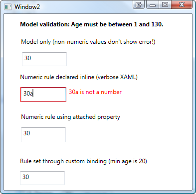
WPF validation through IDataErrorInfo is a great feature if you already have validation logic in you model. However: There is a problem if the user enters a value that cannot be written to model due to value conversion errors. Let’s start with a simple sample:

Karl Shifflet recently updated his article on this very subject, where he outlines an MVVM-based approach to the problem (highly recommended reading material!).
In my case, however, I was looking for a simpler solution. I had validation and views already in place and just wanted a visual representation of invalid input that cannot be bound to the model.
And this is where the good old WPF Validation Rules come back into play:
<TextBox x:Name="txtAge">

  <TextBox.Text>
    <Binding Path="Age" ValidatesOnDataErrors="True">
      <Binding.ValidationRules>
        <rules:NumericRule />
      </Binding.ValidationRules>
    </Binding>
  </TextBox.Text>

</TextBox>
That’s it already! An invalid numeric value (below minimum, above maximum) is handled by the model, everything else is caught be the NumericRule (see attached sample for the sources).

The above sample has one catch – it forces me to write rather verbose XAML. This is where attached properties come to the rescue. Here’s the same thing using an attached property:
<TextBox x:Name="txtAge"
  Text="{Binding Path=Age, ValidatesOnDataErrors=True}"
  rules:Editors.TextRule="{StaticResource numericRule}"
/>
In the sample above, I declared an attached property of type ValidationRule that points to by custom rule. However, depending on your case, you can make your attached property as simple/complex as you need. A great article on this subject was published by WPF master Josh Smith on CodeProject, where he outlines this exact pattern.
As an alternative to attached properties – especially in case you want to define multiple parameters – a custom binding expression might be a simpler approach. If you use a simple Decorator helper class, creating your custom binding class is a breeze:
<TextBox x:Name="txtCustomBinding"
  Text="{local:RuleBinding Path=Age, MinValueOverride=20}"
/>
Here’s my custom binding class, derived from BindingDecoratorBase:
using System;
using System.Windows.Controls;
using System.Windows.Data;
using Hardcodet.Wpf.ValidationRules;

namespace Hardcodet.Wpf.CustomBinding
{
  /// <summary>
  /// A binding extension that checks for a given
  /// numeric value.
  /// </summary>
  public class RuleBinding : BindingDecoratorBase
  {
    /// <summary>
    /// An optional override for the minimum value,
    /// that can be used to narrow the allowed range.
    /// </summary>
    public int? MinValueOverride { get; set; }


    /// <summary>
    /// Creates a new instance of the binding with default values.
    /// </summary>
    public RuleBinding()
    {
      //set default binding directives
      ValidatesOnDataErrors = true;
      UpdateSourceTrigger = UpdateSourceTrigger.PropertyChanged;
    }


    /// <summary>
    /// This method is being invoked during initialization.
    /// </summary>
    /// <param name="provider">Provides access to the bound items.</param>
    /// <returns>The binding expression that is created by
    /// the base class.</returns>
    public override object ProvideValue(IServiceProvider provider)
    {
      //create the validation rule
      ValidationRule rule;
      if (MinValueOverride.HasValue)
      {
        //create a rule that also narrows the minimum value
        rule = new MinNumericRule() {MinValue = MinValueOverride.Value};
      }
      else
      {
        //just make sure the value is numeric
        rule = new NumericRule();
      }

      Binding.ValidationRules.Add(rule);

      //delegate binding creation etc. to the base class
      object val = base.ProvideValue(provider);
      return val;
    }
  }
}
The attached sample shows you all the techniques I described above.
Download sample project: validationrules.zip
Today I came across a nice blog post that described how to create a WPF image button with three different approaches. I’ve always taken an alternative route using attached properties, so here’s a short tutorial that complement’s the techniques outlined on Max’ Blog:
Basically, the work to get there consists of two parts:
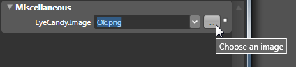
There’s nothing special here – I just declared an attached property named Image, which is of type ImageSource.
using System.Windows;
using System.Windows.Media;

namespace Hardcodet.Wpf.Util
{
  public class EyeCandy
  {
    #region Image dependency property

    /// <summary>
    /// An attached dependency property which provides an
    /// <see cref="ImageSource" /> for arbitrary WPF elements.
    /// </summary>
    public static readonly DependencyProperty ImageProperty;

    /// <summary>
    /// Gets the <see cref="ImageProperty"/> for a given
    /// <see cref="DependencyObject"/>, which provides an
    /// <see cref="ImageSource" /> for arbitrary WPF elements.
    /// </summary>
    public static ImageSource GetImage(DependencyObject obj)
    {
      return (ImageSource) obj.GetValue(ImageProperty);
    }

    /// <summary>
    /// Sets the attached <see cref="ImageProperty"/> for a given
    /// <see cref="DependencyObject"/>, which provides an
    /// <see cref="ImageSource" /> for arbitrary WPF elements.
    /// </summary>
    public static void SetImage(DependencyObject obj, ImageSource value)
    {
      obj.SetValue(ImageProperty, value);
    }

    #endregion

    static EyeCandy()
    {
      //register attached dependency property
      var metadata = new FrameworkPropertyMetadata((ImageSource) null);
      ImageProperty = DependencyProperty.RegisterAttached("Image",
                                                          typeof (ImageSource),
                                                          typeof (EyeCandy), metadata);
    }
  }
}
Once this is done, you can attach the property to arbitrary items. I want to enhance a standard WPF button, so my XAML looks like this:
<Window
  x:Class="Hardcodet.Wpf.Util.Window1"
  xmlns="http://schemas.microsoft.com/winfx/2006/xaml/presentation"
  xmlns:x="http://schemas.microsoft.com/winfx/2006/xaml"
  xmlns:local="clr-namespace:Hardcodet.Wpf.Util">
  <Grid>

    <!-- declare a button with an attached image -->
    <Button
      Content="OK"
      local:EyeCandy.Image="Ok.png" />

  </Grid>
</Window>
However, just setting the attached property doesn’t change anything at all. This is no surprise: After all, the button does not know what to do with the attached image. Yet 🙂
This is were styles come into play. Here’s the button style I used for this sample:
<!--  A button style that displays an attached image -->
<Style
  x:Key="ImageButton"
  TargetType="{x:Type Button}">
  <Setter
    Property="HorizontalContentAlignment"
    Value="Stretch" />
  <Setter
    Property="ContentTemplate">
    <Setter.Value>
      <DataTemplate>
        <Grid>
          <Image
            Source="{Binding Path=(local:EyeCandy.Image),
                     RelativeSource={RelativeSource FindAncestor,
                       AncestorType={x:Type Button}}}"
            HorizontalAlignment="Left"
            Margin="8,0,0,0"
            Height="16"
            Width="16" />
          <TextBlock
            Text="{TemplateBinding Content}"
            HorizontalAlignment="Center" />
        </Grid>
      </DataTemplate>
    </Setter.Value>
  </Setter>
</Style>
A I explicitly named the style, the last step is to assign the style to the button:
<!-- declare a button with an attached image -->
<Button
  Content="OK"
  local:EyeCandy.Image="Ok.png"
  Style="{DynamicResource ImageButton}"
  />
Note that you are not limited to the standard WPF button class. Once the attached property is declared, you can attach an image to whatever control you like. All you have to do is just writing another style. You gotta love WPF 🙂
Blend fully supports attached properties. However, it might take one or two restarts.
User Controls are great, especially if want to create composite controls and provide multiple binding points. However, for simple customization, I still prefer the attached property approach over writing custom controls:
Sample Project: imagebuttons.zip


