Archive

Archive for the ‘WPF’ Category

WPF NotifyIcon 1.0.5 Released

November 25th, 2013

I just published a maintenance release of my NotifyIcon control, which addresses a few (long due) issues, most notably for applications that target more recent versions of the .NET framework, or x64 applications.

Source code and samples can be downloaded via the control’s project page. Alternatively, there’s now also an official NuGet package for the control (binaries only) that contains builds for .NET 3.5 up to 4.5.1.

What’s next?

I already started working on a new version of the control. The most important feature will be interactive tooltips (so you can hover over them and interact with clickable content), along with a few minor new features. Check back in a few days/weeks, or follow me on Twitter in order to get the update once it’s released. Also, if you have specific feature requests, let me know!


Updated ToolTips Library

November 21st, 2013

I just uploaded an updated version of the clickable ToolTips library I released this month. The changes add string formatting for bindings, plus the option to disable ToolTips via a the bindable boolean IsEnabled flag. You can download the current version 1.0.1 here.


Author: Categories: WPF Controls Tags:

Quick and dirty (but nice!) ToolTips – revisited and interactive

November 12th, 2013


Download sources, binaries, and sample application (Version: 1.0.1, 2013.11.22)


A few years ago, I posted an article that leveraged markup extensions to quickly show localized ToolTips with minimal effort. Fast forward to 2013: I still like ToolTips, but interactive / clickable ones would be nice, and there’s Blend Behaviors that provides developers with a great design-time experience. As a result, I wrote a simple control and a complementary Blend Behavior that get’s me quite a bit of flexibility with minimal impementation effort.

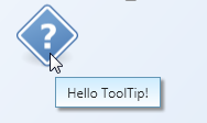
The behavior allows you very easily create simple ToolTips like this:

A simple ToolTip


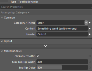
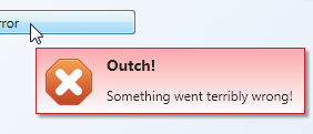
However, it doesn’t stop there. The following Blend Behavior generates an error ToolTip:

Behavior properties in Expression Blend


ErrorToolTip


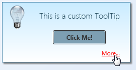
Also, unlike the built-in ToolTip service, the behavior supports interactive/clickable ToolTips. As the ToolTip takes arbitary XAML or a user control for Content or Header properties, you can display arbitrary controls on the popup.

InteractiveToolTip


Features at a glance:

  • Blend Behavior with design-time support – you can setup rich ToolTips within Blend in a matter of seconds.
  • Unlike regular ToolTips, those are clickable – you can put interactive content such as buttons or Hyperlinks on them.
  • Built-in header / content support.
  • Data Binding and MVVM-friendly.
  • Content and header not limited to text.
  • Built-in themes: You can show a ToolTip as an information, warning, or error.
  • If bound to strings, values can be formatted on the fly using the HeaderStringFormat and ContentStringFormat properties.
  • Disabling ToolTips through a bindable IsEnabled flag.


Some final notes: I didn’t make everything configurable – that would have been overkill for the scope of a ToolTip. Instead, I recommend you to tweak the control styles to your needs. Things you might want to change:

  • When being displayed, ToolTips are slightly transparent – full opacity is only set if you hover over them. You can easily adjust this in the animation that fades in the control.
  • If you shorten the delay in which the ToolTip is being displayed remarkably, you should also adjust animations (fade-in / fade-out in order to not cut them off.
  • Placement of the ToolTip’s popup (near Mouse pointer) is currently hardcoded in the Behavior class.

Happy coding 🙂


A Parser for Formatted Text in WPF / Silverlight

November 5th, 2010

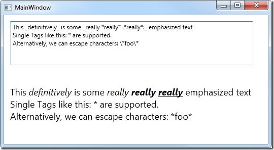
I finally got round to implement on-the-fly text formatting for Sketchables, which will  allow you to define text formatting while typing (similar to wikis or forum posts). Sketchables will parse such strings and format them on the fly for you:

the star renders *bold* text

I didn’t rely on regular expressions here, but wrote a simple forwarding parser to process markup text. As it makes a pretty neat tool, I extracted it into a little sample app that shows a possible use for it. The presented implementation just creates nested text blocks, but you should be able to easily adjust it to your needs.


image

Latest Update:  2010.11.07 – Fixed issue with single character chunks.

Download Sample Application

Sketchables 0.9 – Public Preview Release

July 20th, 2010

I wanted to officially release Sketchables weeks ago, but business just got in the way – and it turned out that my plan to just working at night / on weekends didn’t work either because, well, business got in the way there, too.

However, my deadline ends in little more than a week (and I’ll have quite some time at my hands in August), so I’ll be able to finally package Sketchables, record some more videos, and of course add a few goodies. For now, I’ve prepared a preview release of the package which already works quite solid:


Sketchables Preview


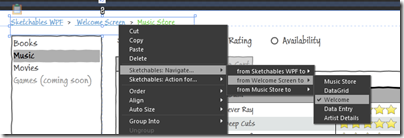
If you compare this package to the contents in the YouTube video, the most prominent addition is built-in navigation support which gives you point-and-click navigation, and allows you to trigger other actions for a Sketchable’s items:

(Click on screenshot to show in full size)

image


As always, critical feedback is appreciated – happy sketching! 🙂

Author: Categories: Open Source, Silverlight, Sketchables, WPF Tags:

Input Focus from the View Model – Configured via Blend Behaviors

March 17th, 2010

Background / Focus of this Article

WPF wizard and fellow WPF Disciple Josh Smith published an article yesterday that showed how to control input focus from View Model objects using attached properties and a custom binding extension. Prior to the article, there was a discussion in the Disciples group, during which I looked into using Blend behaviors as an alternative configuration approach to Josh’s markup extension – this article here discusses this approach.

Accordingly, this posting is not about controlling input focus. Josh did all the legwork there, and you should check out the article on his blog. Everything that goes beyond the Behavior classes is Josh’s work, not mine  – I merely discuss a different approach regarding the declaration of focus control on the UI using Blend Behaviors.


Download Source Code and Sample Application


Differences

Let’s start by looking at the difference from a developer’s point of view. Assume you have a simple TextBox control that is bound to a FirstName property on the View Model:

<!-- simple textbox -->
<TextBox Text="{Binding FirstName}" />


Markup Extensions – One for the XAML Guys / Gals

Josh’s approach using a markup extension is a very lean way to wire up your control with the focus controller. If you’re used to coding in XAML, this is pretty much the quickest way to get things running. Note that only the Binding keyword was replaced by a the custom FocusBinding markup extension:

<!-- simple textbox -->
<TextBox Text="{jas:FocusBinding FirstName}" />


If you’re working in Visual Studio, this is the way to go (even more so if you have ReSharper to take care of the namespace declarations for you). It might become tedious, however, if’ you’re working in a Blend environment: For one thing, there’s the namespace declarations. And then, you can no longer wire up your bindings directly in Blend on the designer surface.


Blend Behaviors – Designer’s Flavor

The Blend Behaviors don’t require you to write any XAML at all. The data binding itself remains unchanged, and the TextBoxFocusBehavior was just dragged/dropped on the TextBox in Blend. Accordingly, you can set up both binding and input focus control with a few mouse clicks without having to leave the designer surface:

image


If you look at XAML source, you’ll notice that the Behavior above actually produces substantially more markup – this isn’t something you’d want to type in manually:

<TextBox Text="{Binding FirstName}" >
    <i:Interaction.Behaviors>
        <FocusVMLib_Behaviors:TextBoxFocusBehavior/>
    </i:Interaction.Behaviors>
</TextBox>


In order to compare the two approaches, just download the attached sample and have a look at the two Window classes. Window1 is the original implementation (using the markup extension), Window2 uses the Blend behaviors. The end result is the same – the only difference is the different declaration approaches.


The Behavior Classes

The rest of this blog post discusses the implementation of the behavior classes, and suggests an approach to support different control types.

Read more…

Author: Categories: WPF Tags: ,