Archive

Posts Tagged ‘Blend’

Quick and dirty (but nice!) ToolTips – revisited and interactive

November 12th, 2013


Download sources, binaries, and sample application (Version: 1.0.1, 2013.11.22)


A few years ago, I posted an article that leveraged markup extensions to quickly show localized ToolTips with minimal effort. Fast forward to 2013: I still like ToolTips, but interactive / clickable ones would be nice, and there’s Blend Behaviors that provides developers with a great design-time experience. As a result, I wrote a simple control and a complementary Blend Behavior that get’s me quite a bit of flexibility with minimal impementation effort.

The behavior allows you very easily create simple ToolTips like this:
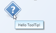
A simple ToolTip


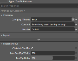
However, it doesn’t stop there. The following Blend Behavior generates an error ToolTip:
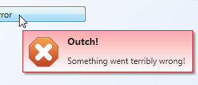
Behavior properties in Expression Blend


ErrorToolTip


Also, unlike the built-in ToolTip service, the behavior supports interactive/clickable ToolTips. As the ToolTip takes arbitary XAML or a user control for Content or Header properties, you can display arbitrary controls on the popup.
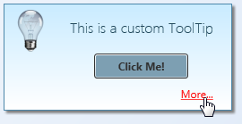
InteractiveToolTip


Features at a glance:

  • Blend Behavior with design-time support – you can setup rich ToolTips within Blend in a matter of seconds.
  • Unlike regular ToolTips, those are clickable – you can put interactive content such as buttons or Hyperlinks on them.
  • Built-in header / content support.
  • Data Binding and MVVM-friendly.
  • Content and header not limited to text.
  • Built-in themes: You can show a ToolTip as an information, warning, or error.
  • If bound to strings, values can be formatted on the fly using the HeaderStringFormat and ContentStringFormat properties.
  • Disabling ToolTips through a bindable IsEnabled flag.


Some final notes: I didn’t make everything configurable – that would have been overkill for the scope of a ToolTip. Instead, I recommend you to tweak the control styles to your needs. Things you might want to change:

  • When being displayed, ToolTips are slightly transparent – full opacity is only set if you hover over them. You can easily adjust this in the animation that fades in the control.
  • If you shorten the delay in which the ToolTip is being displayed remarkably, you should also adjust animations (fade-in / fade-out in order to not cut them off.
  • Placement of the ToolTip’s popup (near Mouse pointer) is currently hardcoded in the Behavior class.

Happy coding 🙂
 

Announcing Sketchables – Rapid Mockup Creation with SketchFlow

May 24th, 2010

SketchFlow is a great addition to Blend, but I was missing the ability to create quick mockups of user interfaces. I’m a huge fan of productivity tools such as Balsamiq, and I was sorely missing its ease and speed in SketchFlow.

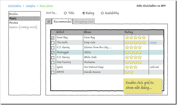
Meet Sketchables. Sketchables is a simple framework complemented by a set of controls that allow you to quickly create common controls in a matter of seconds. Here’s a screenshot from one of the samples, which was created in just a few minutes:

image


…and here’s a complementary recording that shows how the above mockup was created:


Sketchables will be free software, requires Blend 4 RTM and fully supports both WPF and Silverlight SketchFlow projects. Version 1.0 is approaching completion, so I hope I’ll be able to release it as soon as Blend 4 goes live.

Still time for you to slip in some last-minute feature requests though 😉

Using Attached Events to Trigger Animations in WPF

May 8th, 2009

This is a pattern I applied when implementing the WPF NotifyIcon component in order to provide animation support for popups, tooltips, and balloon messages. The problem I had to solve was the loose coupling between the NotifyIcon and displayed controls:


image

Accordingly, I didn’t know anything about these controls at runtime. Nonetheless, I wanted to provide a communication channel to inform that UIElement that it is being displayed. And I wanted to do it declaratively.

Attached Events to the Rescue

Enter attached events. Just like the better known attached properties, they can be declared in a static class and attached to arbitrary dependency objects. Accordingly, a control X does not need to declare an event itself in order to raise it.

If you are working with Expression Blend, chances are high that you are already using attached events quite often. As an example, the Mouse.MouseDown attached event that lets you trigger an animation if the user clicks on an arbitrary control. And nothing stops you from defining your own custom events 🙂

Creating a Sample Application

Let’s create a simple sample. The scenario is the following:

  • Sometimes, some kind of critical event occurs (simulated through a button click).
  • Every time this happens, we want a “status control” to show an alarm.

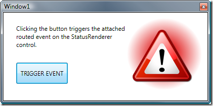
We will implement this status control purely in XAML – an attached event will trigger an animation that displays a warning sign:

image


Read more…

Author: Categories: WPF, WPF Controls Tags: , ,