Quick and dirty (but nice!) ToolTips – revisited and interactive
Download sources, binaries, and sample application (Version: 1.0.1, 2013.11.22)
A few years ago, I posted an article that leveraged markup extensions to quickly show localized ToolTips with minimal effort. Fast forward to 2013: I still like ToolTips, but interactive / clickable ones would be nice, and there’s Blend Behaviors that provides developers with a great design-time experience. As a result, I wrote a simple control and a complementary Blend Behavior that get’s me quite a bit of flexibility with minimal impementation effort.
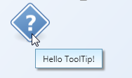
The behavior allows you very easily create simple ToolTips like this:
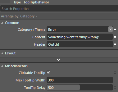
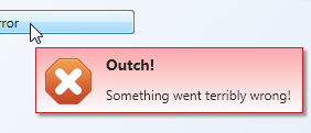
However, it doesn’t stop there. The following Blend Behavior generates an error ToolTip:
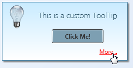
Also, unlike the built-in ToolTip service, the behavior supports interactive/clickable ToolTips. As the ToolTip takes arbitary XAML or a user control for Content or Header properties, you can display arbitrary controls on the popup.
Features at a glance:
- Blend Behavior with design-time support – you can setup rich ToolTips within Blend in a matter of seconds.
- Unlike regular ToolTips, those are clickable – you can put interactive content such as buttons or Hyperlinks on them.
- Built-in header / content support.
- Data Binding and MVVM-friendly.
- Content and header not limited to text.
- Built-in themes: You can show a ToolTip as an information, warning, or error.
- If bound to strings, values can be formatted on the fly using the HeaderStringFormat and ContentStringFormat properties.
- Disabling ToolTips through a bindable IsEnabled flag.
Some final notes: I didn’t make everything configurable – that would have been overkill for the scope of a ToolTip. Instead, I recommend you to tweak the control styles to your needs. Things you might want to change:
- When being displayed, ToolTips are slightly transparent – full opacity is only set if you hover over them. You can easily adjust this in the animation that fades in the control.
- If you shorten the delay in which the ToolTip is being displayed remarkably, you should also adjust animations (fade-in / fade-out in order to not cut them off.
- Placement of the ToolTip’s popup (near Mouse pointer) is currently hardcoded in the Behavior class.
Happy coding 🙂


Wow, talk about a long break. ;P
I don’t need it right now, but I’ll keep in mind that you already made a custom tooltip, in case I ever need it. 😉
@Daniel
I’ll just pretend I’ve been blogging under a pseudonym for the last 3 years 😉
Hi Philipp
what a nice Tooltip implementation! In your examples, the ToolTips are added exclusively in XAML.. how would I do so in code?
dear Philipp,
“Unlike regular ToolTips, those are clickable – you can put interactive content such as buttons or Hyperlinks on them”. But It seems the interactive fountion does not work in your sample.