Search Results

Keyword: ‘markup extension’

WCF REST Client Library for Silverlight

February 8th, 2010

I’ve been doing some hackery and ported the client libraries of the WCF REST Starter Kit to Silverlight. The library greatly simplifies things when it comes to accessing and consuming RESTful services and resources in your Silverlight application:


//send a HTTP GET request for a given resource
HttpClient client = new HttpClient("http://localhost:56789/root");
HttpResponseMessage response = client.Get();

//parse the received resource markup on the fly
VirtualFolder folder = response.Content.ReadAsDataContract<VirtualFolder>();


I have removed a few bits, but most of the functionality should be there, and I added “NOTE” comments to all the sections that I had to modify. I haven’t used this port in-depth but managed to access my RESTful resources as expected so far, and I hope it will work just fine as in most scenarios that are covered in the original Starter Kit. Of course, given the Starter Kit itself is kind of experimental, this applies to this release even more.


Attention: Blocking vs. Async Requests

If you try to initiate a blocking request to your REST service on the UI thread, I will hit you with an InvalidOperationException due to synchronization issues. Accordingly, a snippet as the one above should always be invoked on a worker thread (which is a best practice anyway).

However, in order to simplify things, I’ve added a bunch of XXXAsync extension methods for the HttpClient class that allow you to invoke HTTP operations such as GET, POST, PUT etc. directly on the UI thread, and have the result delivered back to you through a simple callback action:

public void GetFolder()
{
  HttpClient client = new HttpClient("http://localhost:56789/root");

  //you can invoke the GetAsync method on a worker thread
  client.GetAsync(response =>
    {
      VirtualFolder folder = response.Content.ReadAsDataContract<VirtualFolder>();
    });
}


Note that the callback action will be invoked on a worker thread, so you might have to switch back to the UI thread if you want to modify your UI.


Oh yes: Use at your own risk ;)


Download REST Starter Kit for Silverlight

Current Version: 1.0.1, 2010.02.08

Tags: ,

Declaring Custom WPF Commands via MarkupExtensions

April 25th, 2009

And yet another markup extension that hopefully makes things a little easier for you. Basically, it’s the same pattern that the good doctor described here for value converters, but with custom commands in mind.

Without Extension

Basically, this extension makes your commands immediately available without having to declare them. One "traditional" way to declare a command is directly in XAML:

<Window.Resources>

  <cmd:HelloWorldCommand x:Key="SayHello" />

</Window.Resources>


…and then apply it like this:

<Button Command="{StaticResource SayHello}" />


Using the Markup Extension

The declaration part above can become somewhat tedious, especially if you have quite a few commands (e.g. because you are using a ribbon with lots of buttons on it). Thanks to using a markup extension, you can skip the declaration part altogether and just declare your command.

<Button Command="{cmd:HelloWorldCommand}" />


Implementation and Sample


/// <summary>
/// Basic implementation of the <see cref="ICommand"/>
/// interface, which is also accessible as a markup
/// extension.
/// </summary>
public abstract class CommandExtension<T> : MarkupExtension, ICommand
    where T:class, ICommand, new()
{
  /// <summary>
  /// A singleton instance.
  /// </summary>
  private static T command;

  /// <summary>
  /// Gets a shared command instance.
  /// </summary>
  public override object ProvideValue(IServiceProvider serviceProvider)
  {
    if (command == null) command = new T();
    return command;
  }

  /// <summary>
  /// Fires when changes occur that affect whether
  /// or not the command should execute.
  /// </summary>
  public event EventHandler CanExecuteChanged
  {
    add { CommandManager.RequerySuggested += value; }
    remove { CommandManager.RequerySuggested -= value; }
  }

  /// <summary>
  /// Defines the method to be called when the command is invoked.
  /// </summary>
  /// <param name="parameter">Data used by the command.
  /// If the command does not require data to be passed,
  /// this object can be set to null.
  /// </param>
  public abstract void Execute(object parameter);

  /// <summary>
  /// Defines the method that determines whether the command
  /// can execute in its current state.
  /// </summary>
  /// <returns>
  /// This default implementation always returns true.
  /// </returns>
  /// <param name="parameter">Data used by the command.  
  /// If the command does not require data to be passed,
  /// this object can be set to null.
  /// </param>
  public virtual bool CanExecute(object parameter)
  {
    return true;
  }
}


…and here’s a sample implementation:

public class HelloWorldCommand : CommandExtension<HelloWorldCommand>
{
  public override void Execute(object parameter)
  {
    MessageBox.Show("Hello world.");
  }
}


Of course, nothing prevents you from pimping the base class a little to your needs :-)

Tags: ,

Quick and Dirty (but nice!) ToolTips via Markup Extensions

April 19th, 2009

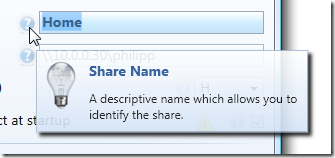
NetDrives does not rely on styles when it comes to displaying ToolTips, but uses a simple markup extension, that provides the following functionality:

  • Displays a nice looking ToolTip rather than just plain text.
  • Optional lookup of strings in a resource dictionary to simplify localization.
  • Optional title text.
  • Very simple declaration.

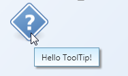
Here’s what the XAML looks like:
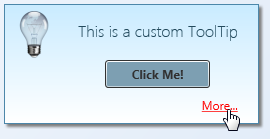
<Image
  Source="..\Shared\Images\HelpSmall.png"
  ToolTip="{ext:Info Title=ShareNameTitleToolTip, Body=ShareNameInfoToolTip}"
  />


…and this is the output:

image

Creating the Popup Control

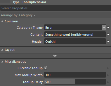
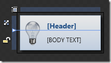
The first step is to create a simple control that contains the ToolTip. Basically, this is a simple UserControl with the following features:

  • A grid with two rows. The first row contains just the title and is auto-sized to make sure it collapses if the title is not used at all.
  • Two TextBlocks for title and body text.
  • An image (I didn’t make that one bindable, I always use the same one).
  • Two dependency properties that provide binding capabilities for header and body text.

Here’s what the control looks like in Blend:

image

Of course, you can easily use this user control through styles and/or directly declared in XAML whenever you need:

<Image Source="..\Shared\Images\HelpSmall.png">
  <Image.ToolTip>
    <MyToolTipControl Header="My Title" Body="This is a ToolTip" />
  </Image.ToolTip>
</Image>

However, this would still take a style to hide the tooltip border and you are lacking resource file lookups. The markup extension makes this way easier…

Implementing the Markup Extension

MarkupExtension is one of the lesser known stars in WPF - it requires a little coding, but once in place, it greatly simplify things for you. A simple yet brilliant example is Dr. WPF’s ValueConverter extension, and I already blogged a few times about other applications.

This Info markup extension basically provides the following:

  • Two properties (Title and Body)
  • Resource lookup with fallback mechanism (string is used directly if it’s not a resource key)
  • ToolTip creation


/// <summary>
/// A markup extension that returns a
/// <see cref="InfoPopup"/> control preconfigured
/// with header and text information according to the
/// <see cref="Title"/> and <see cref="Body"/>
/// properties.
/// </summary>
public class Info : MarkupExtension
{
  /// <summary>
  /// Either a title text or a resource key that can be used
  /// to look up the title.
  /// </summary>
  public string Title { get; set; }

  /// <summary>
  /// Either a tooltips' main text or a resource key that can be used
  /// to look up the text.
  /// </summary>
  public string Body { get; set; }

  /// <summary>
  /// Empty default constructor.
  /// </summary>
  public Info()
  {
  }

  /// <summary>
  /// Inits the <see cref="Info"/> markup extension
  /// with the title and body.
  /// </summary>
  public Info(string title, string body)
  {
    Title = title;
    Body = body;
  }

  /// <summary>
  /// Performs a lookup for the defined <see cref="Title"/> and
  /// <see cref="Info"/> and creates the tooltip control.
  /// </summary>
  /// <returns>
  /// A tooltip control.
  /// </returns>
  public override object ProvideValue(IServiceProvider serviceProvider)
  {
    //create the user control that 
    InfoPopup popup = new InfoPopup();

    if (!String.IsNullOrEmpty(Title))
    {
      //look up title - if the string is not a
      //resource key, use it directly
      var result = Resources.ResourceManager.GetObject(Title) ?? Title;
      popup.HeaderText = (string)result;
    }

    if (!String.IsNullOrEmpty(Body))
    {
      //look up body text - if the string is not a
      //resource key, use it directly
      var result = Resources.ResourceManager.GetObject(Body) ?? Body;
      popup.BodyText = (string)result;
    }

    //create tooltip and make sure only the content is visible
    ToolTip tt = new ToolTip();
    tt.HasDropShadow = false;
    tt.BorderThickness = new Thickness(0);
    tt.Background = Brushes.Transparent;
    tt.Content = popup;

    return tt;
  }
}

Conclusion and Sample

This is only one of several ways to tackle the problem, but I really like that it only takes a single line to have a rich ToolTip in place. The implementation provided here may not completely suit your requirements, but it can easily be tailored to your needs.

The link below points to a sample project that contains both the markup extension and ToolTip control. Enjoy :-)

tooltip-extension.zip


kick it on DotNetKicks.com

Format WPF Bindings With Resource File Lookups

March 21st, 2009

This post explains a pattern that combines Data Binding, the new StringFormat property and resource lookups through the application of a custom MarkupExtension.


StringFormat

Microsoft introduced the StringFormat property with SP1 for .NET 3.5. StringFormat often eliminates the need for a custom converter if you just need to format a bound value.
Here’s a very simple sample that displays hello xxx on the screen (where “xxx” is the value entered in a TextBox control:


<TextBox
    x:Name="name"
    Text="world" />

<TextBlock
    Text="{Binding ElementName=name,
                   Path=Text,
                   StringFormat=hello \{0\}}" />


Resource Files

I often use resource files to store strings - not only for localization tasks but also in order to maintain strings that are intended for users at a central place. My resource strings often contain placeholders which are populated at runtime using String.Format:


image


//use resource file to create message
var msg = Resources.Ask_Whether_To_Connect_To_New_Share;
msg = String.Format(msg, configuration.Name);

//display dialog
MessageBoxResult doConnect = Dialogs.ShowYesNo(msg);


Bringing Bindings and Resource Files Together

In the sample above, I accessed the resource file programmatically. In XAML however, I prefer a declarative approach. In order to get there, I implemented a simple MarkupExtension that allows me to do just that:


<!-- Display a formatted text -->
<TextBlock
  x:Name="Title"
  Text="{Binding Path=Name,
                 StringFormat={ext:Resource Ask_Whether_To_Connect_To_New_Share}}"

 />


The above snippet results in a formatted text being displayed:

image


Resource MarkupExtension

Here’s the markup extension. As you can see, it’s fairly trivial. Do note that the reference to the application’s Resources file is hardcoded - you will have to set a using statement or adjust that line in order to use your custom resource file.


/// <summary>
/// A markup extension that provides simple access to a given
/// entry in the application's <see cref="Resources"/> file.
/// </summary>
public class Resource : MarkupExtension
{
  /// <summary>
  /// The resource key to be used for the lookup.
  /// </summary>
  public string ResourceKey { get; set; }

  /// <summary>
  /// Inits the <see cref="Resource"/> markup extension
  /// with the key to be assigned.
  /// </summary>
  /// <param name="resourceKey">The resource key to be assigned.</param>
  public Resource(string resourceKey)
  {
    ResourceKey = resourceKey;
  }

  /// <summary>
  /// Performs a lookup for the defined <see cref="ResourceKey"/>.
  /// </summary>
  /// <returns>
  /// The value of the resource that is specified by the
  /// <see cref="ResourceKey"/> property. If the property is not
  /// set, a null reference is returned.
  /// </returns>
  public override object ProvideValue(IServiceProvider serviceProvider)
  {
    if (String.IsNullOrEmpty(ResourceKey)) return null;
    return Resources.ResourceManager.GetObject(ResourceKey);
  }
}


Enjoy :)

Tags: ,

Combining WPF Validation Rules and IDataErrorInfo to Resolve Conversion Errors

January 8th, 2009

This article discusses a few approaches to overcome binding conversion errors in WPF by combining model validation (through IDataErrorInfo) and WPF validation rules. Practically, I’m going to outline three approaches to the same solution:

  • Inline declaration
  • Using attached properties
  • Using custom binding classes


image

The Problem

WPF validation through IDataErrorInfo is a great feature if you already have validation logic in you model. However: There is a problem if the user enters a value that cannot be written to model due to value conversion errors. Let’s start with a simple sample:

  • A TextBox is bound to a numeric Age property of your model.
  • As soon as the user enters a value in the Textbox, the property on the model is updated. The model then validates whether the entered value is valid (range from 1 to 130 years).
  • However: If the user enters a string rather than a number (e.g. “30a”), the value conversion to an integer fails. In this case, WPF does not show an error at all:

image


Karl Shifflet recently updated his article on this very subject, where he outlines an MVVM-based approach to the problem (highly recommended reading material!).

In my case, however, I was looking for a simpler solution. I had validation and views already in place and just wanted a visual representation of invalid input that cannot be bound to the model.


WPF Validation Rules to the Rescue

And this is where the good old WPF Validation Rules come back into play:

  1. A binding with ValidatesOnDataErrors=True ensures that the model validation logic is being invoked.
  2. Additional WPF Validation Rules take care of invalid input that can not be bound to the model.


<TextBox x:Name="txtAge">

  <TextBox.Text>
    <Binding Path="Age" ValidatesOnDataErrors="True">
      <Binding.ValidationRules>
        <rules:NumericRule />
      </Binding.ValidationRules>
    </Binding>
  </TextBox.Text>

</TextBox>


That’s it already! An invalid numeric value (below minimum, above maximum) is handled by the model, everything else is caught be the NumericRule (see attached sample for the sources).

image


Simplify Markup 1: Attached Properties

The above sample has one catch - it forces me to write rather verbose XAML. This is where attached properties come to the rescue. Here’s the same thing using an attached property:


<TextBox x:Name="txtAge"
  Text="{Binding Path=Age, ValidatesOnDataErrors=True}"
  rules:Editors.TextRule="{StaticResource numericRule}"
/>


In the sample above, I declared an attached property of type ValidationRule that points to by custom rule. However, depending on your case, you can make your attached property as simple/complex as you need. A great article on this subject was published by WPF master Josh Smith on CodeProject, where he outlines this exact pattern.


Simplify Markup 2: Custom Binding Classes

As an alternative to attached properties - especially in case you want to define multiple parameters - a custom binding expression might be a simpler approach. If you use a simple Decorator helper class, creating your custom binding class is a breeze:


<TextBox x:Name="txtCustomBinding"
  Text="{local:RuleBinding Path=Age, MinValueOverride=20}"
/>


Here’s my custom binding class, derived from BindingDecoratorBase:

using System;
using System.Windows.Controls;
using System.Windows.Data;
using Hardcodet.Wpf.ValidationRules;

namespace Hardcodet.Wpf.CustomBinding
{
  /// <summary>
  /// A binding extension that checks for a given
  /// numeric value.
  /// </summary>
  public class RuleBinding : BindingDecoratorBase
  {
    /// <summary>
    /// An optional override for the minimum value,
    /// that can be used to narrow the allowed range.
    /// </summary>
    public int? MinValueOverride { get; set; }

    /// <summary>
    /// Creates a new instance of the binding with default values.
    /// </summary>
    public RuleBinding()
    {
      //set default binding directives
      ValidatesOnDataErrors = true;
      UpdateSourceTrigger = UpdateSourceTrigger.PropertyChanged;
    }

    /// <summary>
    /// This method is being invoked during initialization.
    /// </summary>
    /// <param name="provider">Provides access to the bound items.</param>
    /// <returns>The binding expression that is created by
    /// the base class.</returns>
    public override object ProvideValue(IServiceProvider provider)
    {
      //create the validation rule
      ValidationRule rule;
      if (MinValueOverride.HasValue)
      {
        //create a rule that also narrows the minimum value
        rule = new MinNumericRule() {MinValue = MinValueOverride.Value};
      }
      else
      {
        //just make sure the value is numeric
        rule = new NumericRule();
      }

      Binding.ValidationRules.Add(rule);

      //delegate binding creation etc. to the base class
      object val = base.ProvideValue(provider);
      return val;
    }
  }
}


The attached sample shows you all the techniques I described above.

Download sample project: validationrules.zip

kick it on DotNetKicks.com

Tags: ,

A base class for custom WPF binding markup extensions

April 16th, 2008

Already tried to extend the Binding or BindingBase classes in order to write your own custom bindings? And failed because BindingBase.ProvideValue is sealed? Me too…

The result is a MarkupExtension that works around the issue that you cannot properly extend the Binding class. Basically, it allows you to write binding expressions with the usual syntax without having to worry about the underlying plumbing. Here’s a sample binding that adds an additional LookupKey property:

<TextBox Name="txtZipCode"
         Text="{local:LookupExtension Path=ZipCode,
                                      Mode=TwoWay,
                                      UpdateSourceTrigger=PropertyChanged,
                                      LookupKey=F5}"
/>


Decorating the Binding class

As extending the Binding class did not work, I tried a different approach:

  • Create a class that extends MarkupExtension rather than BindingBase. This class provides all the properties that are needed for a binding expression (Source, Path, Converter, …).
  • Based on defined binding properties, the extension class internally creates a regular Binding and associates it with the targeted dependency object.

I wanted it to look somehow like this (dummy code!):

public class MyCustomExtension : MarkupExtension
{
  public override object ProvideValue(IServiceProvider provider)
  {
    //we only use this extension on textboxes
    TextBox tb = GetTextBoxFromProvider(provider);

    //create a binding and associate it with the text box
    Binding binding = CreateBinding(this.Source, this.Path);
    tb.SetBinding(TextBox.TextProperty, binding);

    //return a valid value
    return ...;
  }
}

And guess what - that worked :)

The result is an abstract base class that provides pretty much everything you need to create your custom binding classes. The BindingDecoratorBase provides properties for all kinds of binding expressions (Source, Path, Converter etc.) and handles binding creation and association with the targeted dependency object for you:

 image

Basically, the class maintains its own binding class and just forwards the binding statements. For example, here’s the declaration of the Path property:

[DefaultValue(null)]
public PropertyPath Path
{
  get { return binding.Path; }
  set { binding.Path = value; }
}
 

Custom Binding Sample

Here’s a simple sample: Let’s say we have a TextBox that displays the ZipCode property of a bound item. The XAML for this bound control looks like this:

<TextBox Name="txtZipCode"
         Text="{Binding Path=ZipCode}"
/>

However, we want to interfere with the binding in order to add some additional value. For this example, we’d like to register the bound control with some kind of handler class. We could also do this with an attached property, but this is more fun ;)

First, I created a custom extension called LookupExtension that derives from BindingDecoratorBase. BindingDecoratorBase provides all binding properties out of the box, so the binding expression itself (Path=ZipCode) remains intact. The only thing I had to change in XAML was the extension name and add the custom property for my extension (LookupKey):

<TextBox Name="txtZipCode"
         Text="{local:LookupExtension Path=ZipCode,
                                      LookupKey=F5}"
/>

As LookupExtension derives from BindingDecoratorBase, it is ensured that in the end, the text box will be bound to the ZipCode property just like with the original regular binding expression.

Below is a first implementation which does not yet add any additional value. Therefore, this extension would behave exactly like the original binding - the ZipCode property of the bound data item is displayed, and updating the TextBox changes the bound property value:

public class LookupExtension : BindingDecoratorBase
{
  //A property that can be set in XAML
  public string LookupKey { get; set; }

  public override object ProvideValue(IServiceProvider provider)
  {
    //delegate binding creation etc. to the base class
    return base.ProvideValue(provider);
  }
}

So what’s left is adding some custom code to the extension. Below is the complete sample. Basically, the bound control (the text box of the sample) is determined by invoking TryGetTargetItems and then registered with an InputHandler. That’s it:

public class LookupExtension : BindingDecoratorBase
{
  //A property that can be set in XAML
  public string LookupKey { get; set; }

  public override object ProvideValue(IServiceProvider provider)
  {
    //delegate binding creation etc. to the base class
    object val = base.ProvideValue(provider);

    //try to get bound items for our custom work
    DependencyObject targetObject;
    DependencyProperty targetProperty;
    bool status = TryGetTargetItems(provider, out targetObject,
                                              out targetProperty);

    if (status)
    {
      //associate an input listener with the control
      InputHandler.RegisterHandler(targetObject, LookupKey);
    }

    return val;
  }
}

Note the status flag in the snippet above! ProvideValue is also invoked at design time (within Visual Studio). In this case, the provider parameter is null, so be careful to validate your parameters or you’ll end up with a broken designer.


Problem: Attribute syntax with resources

During the implementation of the sample, I came across an annoying issue: You cannot nest static or dynamic resources within a custom markup extension due to a framework bug. This means that if you wanted to set the Source property explicitly, you could not write it like this:

<TextBox Name="txtZipCode"
         Text="{local:LookupExtension Source={StaticResource MyAddress}
                                      Path=ZipCode,
                                      LookupKey=F5}"
/>

The above snippet does not compile due to a bug I described here. As a result, you have to fall back to property element syntax if you need to explicitly setting the Source property or other resources (e.g. Converter):

<TextBox Name="txtZipCode">
  <TextBox.Text>
    <local:LookupExtension Source="{StaticResource MyAddress}"
                           Path="ZipCode"
                           LookupKey="F5" />
  </TextBox.Text>
</TextBox>


Source Code / Sample

I’ve assembled a simple project that contains the BindingDecoratorBase class and the LookupExtension I used as a sample (VS 2008 project).

You can download it here: custom-bindings.zip

Markup Extension Sample

Tags: ,