Archive

Posts Tagged ‘WPF’

ComboBox SelectedItem and ItemsSource: Order Matters

January 14th, 2009

A co-worker of mine had a strange issue with a bound combo box that looked like this: 

<ComboBox
  x:Name="cboParentUser"
  ItemsSource="{Binding Path=Order.Store.Users, ElementName=me, Mode=Default}"
  SelectedItem="{Binding Path=Order.ParentUser, ElementName=me, Mode=Default}"
  IsEditable="False"
  DisplayMemberPath="UserName" />


As we could observe at runtime, selecting an item in the combo box properly updated the underlying ParentUser property. Furthermore, we could easily exchange the data context (Order dependency property) in order to edit different items.

However: As soon a the editor control that contained the combo box was unloaded, the ParentUser property of the currently edited Order was set to null, so all previously made adjustments were lost.

The reason behind this behavior seems to be the fact that both ItemsSource and SelectedItem are bound to the same dependency property: Apparently, when Order is set to null during unloading, WPF realizes that the ItemsSource is no longer valid, and therefore clears the SelectedItem, to which the combo box still appears to hold a reference at this moment – which brings it down to a question of proper coercion. Or maybe not – the reason behind this is not entirely clear to me.

However: Changing the declaration order of SelectedItem and ItemsSource fixes the problem:

<ComboBox
  x:Name="cboParentUser"
  SelectedItem="{Binding Path=Order.ParentUser, ElementName=me, Mode=Default}"
  ItemsSource="{Binding Path=Order.Store.Users, ElementName=me, Mode=Default}"
  IsEditable="False"
  DisplayMemberPath="UserName" />


And yes: This does feel like a dirty hack.

Author: Categories: WPF, WPF Controls Tags: ,

Combining WPF Validation Rules and IDataErrorInfo to Resolve Conversion Errors

January 8th, 2009

This article discusses a few approaches to overcome binding conversion errors in WPF by combining model validation (through IDataErrorInfo) and WPF validation rules. Practically, I’m going to outline three approaches to the same solution:

  • Inline declaration
  • Using attached properties
  • Using custom binding classes


image

The Problem

WPF validation through IDataErrorInfo is a great feature if you already have validation logic in you model. However: There is a problem if the user enters a value that cannot be written to model due to value conversion errors. Let’s start with a simple sample:

  • A TextBox is bound to a numeric Age property of your model.
  • As soon as the user enters a value in the Textbox, the property on the model is updated. The model then validates whether the entered value is valid (range from 1 to 130 years).
  • However: If the user enters a string rather than a number (e.g. “30a”), the value conversion to an integer fails. In this case, WPF does not show an error at all:

image


Karl Shifflet recently updated his article on this very subject, where he outlines an MVVM-based approach to the problem (highly recommended reading material!).

In my case, however, I was looking for a simpler solution. I had validation and views already in place and just wanted a visual representation of invalid input that cannot be bound to the model.


WPF Validation Rules to the Rescue

And this is where the good old WPF Validation Rules come back into play:

  1. A binding with ValidatesOnDataErrors=True ensures that the model validation logic is being invoked.
  2. Additional WPF Validation Rules take care of invalid input that can not be bound to the model.


<TextBox x:Name="txtAge">
  
  <TextBox.Text>
    <Binding Path="Age" ValidatesOnDataErrors="True">
      <Binding.ValidationRules>
        <rules:NumericRule />
      </Binding.ValidationRules>
    </Binding>
  </TextBox.Text>

</TextBox>


That’s it already! An invalid numeric value (below minimum, above maximum) is handled by the model, everything else is caught be the NumericRule (see attached sample for the sources).

image


Simplify Markup 1: Attached Properties

The above sample has one catch – it forces me to write rather verbose XAML. This is where attached properties come to the rescue. Here’s the same thing using an attached property:


<TextBox x:Name="txtAge"
  Text="{Binding Path=Age, ValidatesOnDataErrors=True}"
  rules:Editors.TextRule="{StaticResource numericRule}"  
/>


In the sample above, I declared an attached property of type ValidationRule that points to by custom rule. However, depending on your case, you can make your attached property as simple/complex as you need. A great article on this subject was published by WPF master Josh Smith on CodeProject, where he outlines this exact pattern.


Simplify Markup 2: Custom Binding Classes

As an alternative to attached properties – especially in case you want to define multiple parameters – a custom binding expression might be a simpler approach. If you use a simple Decorator helper class, creating your custom binding class is a breeze:


<TextBox x:Name="txtCustomBinding"
  Text="{local:RuleBinding Path=Age, MinValueOverride=20}"
/>


Here’s my custom binding class, derived from BindingDecoratorBase:

using System;
using System.Windows.Controls;
using System.Windows.Data;
using Hardcodet.Wpf.ValidationRules;

namespace Hardcodet.Wpf.CustomBinding
{
  /// <summary>
  /// A binding extension that checks for a given
  /// numeric value.
  /// </summary>
  public class RuleBinding : BindingDecoratorBase
  {
    /// <summary>
    /// An optional override for the minimum value,
    /// that can be used to narrow the allowed range.
    /// </summary>
    public int? MinValueOverride { get; set; }


    /// <summary>
    /// Creates a new instance of the binding with default values.
    /// </summary>
    public RuleBinding()
    {
      //set default binding directives
      ValidatesOnDataErrors = true;
      UpdateSourceTrigger = UpdateSourceTrigger.PropertyChanged;
    }


    /// <summary>
    /// This method is being invoked during initialization.
    /// </summary>
    /// <param name="provider">Provides access to the bound items.</param>
    /// <returns>The binding expression that is created by
    /// the base class.</returns>
    public override object ProvideValue(IServiceProvider provider)
    {
      //create the validation rule
      ValidationRule rule;
      if (MinValueOverride.HasValue)
      {
        //create a rule that also narrows the minimum value
        rule = new MinNumericRule() {MinValue = MinValueOverride.Value};
      }
      else
      {
        //just make sure the value is numeric
        rule = new NumericRule();
      }

      Binding.ValidationRules.Add(rule);

      //delegate binding creation etc. to the base class
      object val = base.ProvideValue(provider);
      return val;
    }
  }
}


The attached sample shows you all the techniques I described above.

Download sample project: validationrules.zip

kick it on DotNetKicks.com

Author: Categories: Uncategorized Tags: ,

Using Attached Properties to Create a WPF Image Button

January 7th, 2009

Today I came across a nice blog post that described how to create a WPF image button with three different approaches. I’ve always taken an alternative route using attached properties, so here’s a short tutorial that complement’s the techniques outlined on Max’ Blog:


 image


Basically, the work to get there consists of two parts:

  • Declare an attached property that gets an image source.
  • Create a style (or multiple styles) that makes use of the attached property in order to display the image.


Attached Property

There’s nothing special here – I just declared an attached property named Image, which is of type ImageSource.


using System.Windows;
using System.Windows.Media;

namespace Hardcodet.Wpf.Util
{
  public class EyeCandy
  {
    #region Image dependency property

    /// <summary>
    /// An attached dependency property which provides an
    /// <see cref="ImageSource" /> for arbitrary WPF elements.
    /// </summary>
    public static readonly DependencyProperty ImageProperty;

    /// <summary>
    /// Gets the <see cref="ImageProperty"/> for a given
    /// <see cref="DependencyObject"/>, which provides an
    /// <see cref="ImageSource" /> for arbitrary WPF elements.
    /// </summary>
    public static ImageSource GetImage(DependencyObject obj)
    {
      return (ImageSource) obj.GetValue(ImageProperty);
    }

    /// <summary>
    /// Sets the attached <see cref="ImageProperty"/> for a given
    /// <see cref="DependencyObject"/>, which provides an
    /// <see cref="ImageSource" /> for arbitrary WPF elements.
    /// </summary>
    public static void SetImage(DependencyObject obj, ImageSource value)
    {
      obj.SetValue(ImageProperty, value);
    }

    #endregion

    static EyeCandy()
    {
      //register attached dependency property
      var metadata = new FrameworkPropertyMetadata((ImageSource) null);
      ImageProperty = DependencyProperty.RegisterAttached("Image",
                                                          typeof (ImageSource),
                                                          typeof (EyeCandy), metadata);
    }
  }
}


Property Declaration

Once this is done, you can attach the property to arbitrary items. I want to enhance a standard WPF button, so my XAML looks like this:

<Window
  x:Class="Hardcodet.Wpf.Util.Window1"
  xmlns="http://schemas.microsoft.com/winfx/2006/xaml/presentation"
  xmlns:x="http://schemas.microsoft.com/winfx/2006/xaml"
  xmlns:local="clr-namespace:Hardcodet.Wpf.Util">
  <Grid>
    
    <!-- declare a button with an attached image -->
    <Button
      Content="OK"
      local:EyeCandy.Image="Ok.png" />
    
  </Grid>
</Window>


Providing a Button Style

However, just setting the attached property doesn’t change anything at all. This is no surprise: After all, the button does not know what to do with the attached image. Yet 🙂

This is were styles come into play. Here’s the button style I used for this sample:


<!--  A button style that displays an attached image -->
<Style
  x:Key="ImageButton"
  TargetType="{x:Type Button}">
  <Setter
    Property="HorizontalContentAlignment"
    Value="Stretch" />
  <Setter
    Property="ContentTemplate">
    <Setter.Value>
      <DataTemplate>
        <Grid>
          <Image
            Source="{Binding Path=(local:EyeCandy.Image),
                     RelativeSource={RelativeSource FindAncestor,
                       AncestorType={x:Type Button}}}"
            HorizontalAlignment="Left"
            Margin="8,0,0,0"
            Height="16"
            Width="16" />
          <TextBlock
            Text="{TemplateBinding Content}"
            HorizontalAlignment="Center" />
        </Grid>
      </DataTemplate>
    </Setter.Value>
  </Setter>
</Style>


A I explicitly named the style, the last step is to assign the style to the button:

<!-- declare a button with an attached image -->
<Button
  Content="OK"
  local:EyeCandy.Image="Ok.png"
  Style="{DynamicResource ImageButton}"
  />


Note that you are not limited to the standard WPF button class. Once the attached property is declared, you can attach an image to whatever control you like. All you have to do is just writing another style. You gotta love WPF 🙂


Blend Design Time Support

Blend fully supports attached properties. However, it might take one or two restarts.

image


Conclusion

User Controls are great, especially if want to create composite controls and provide multiple binding points. However, for simple customization, I still prefer the attached property approach over writing custom controls:

  • Apart from the property declaration, everything else is pure XAML.
  • I can style whatever control I like: Commercial 3rd party controls, tab headers, borders etc. without having to create new controls or even write code. All I have to do is create a new style.
  • Its fully up to the designer how to style controls one the properties have been declared. And I can even write multiple styles for the same control type in order to provide a different look and feel for a given control.


Sample Project: imagebuttons.zip

kick it on DotNetKicks.com

Author: Categories: WPF Controls Tags: ,

Microsoft WPF DataGrid vs. Commercial Solution: 1:0

December 30th, 2008

I’ve never been really happy with the commercial data grid I’ve been using so far – the whole API felt somewhat “winformish”, and required my to write a lot of XAML or even code for even the most basic tasks.

Today, I needed a simple grid on one of my current projects, and immediately got annoyed by the same issues that bug me every time. With the difference that this time, I had a new alternative to look at – Microsoft’s Data Grid that went V1 this October.

Well: This is an amazing control. It’s not amazingly powerful, it doesn’t have amazing animations, amazing views or anything like that. There is just one thing: It gets the job done.

Here’s my top 3 in comparison to my commercial product:

1: Data Binding

Finally I have data binding the way I always thought it should be. No more dealing with the internal data representation of the grid, and 2-way-data binding to selected items (not records or rows) out of the box. I didn’t even have to look up the API – it’s just as I expected it to be. Loving it:


<dg:DataGrid
  x:Name="platforms"
  ItemsSource="{Binding Path=Track.Platforms, ElementName=me}"
  SelectedItem="{Binding Path=ActivePlatform, ElementName=me}">

<!-- column definitions -->

</dg:DataGrid>


2: Liquid (Star-Sized) Columns

To my great surprise, I can easily star-size columns to take the full available horizontal space of the grid. This is a feature I need as good as every time I use a grid. With my commercial product, I was forced to write a whole layout template in order to get there. Not anymore:


<dg:DataGrid.Columns>
  <!-- fixed size column -->
  <dg:DataGridTextColumn
    Header="Name"
    Width="60" 
    Binding="{Binding Path=ItemName}" />
  <!-- takes 2/3 of the remaining space -->
  <dg:DataGridTextColumn
    Header="Description"
    Width="2*"
    Binding="{Binding Path=Description}" />
  <!-- takes 1/3 of the remaining space -->
  <dg:DataGridTextColumn
    Header="Position"
    Width="*"
    Binding="{Binding Path=StartPosition}" />
</dg:DataGrid.Columns>


3: Styling

I really do like some of the carefully crafted themes of my commercial grid. But on the other hand, customizing it was a major pain, so styling was one of my main concerns. However, the MS grid is amazingly flexible and easy to use for a v1.0 solution.

In the end, I’m happier with my custom-styled result than the predefined theme of my commercial grid – simply because the custom style blends in perfectly with the rest of the UI:

styledgrid

checklist


Conclusion

I’m pretty sure that the commercial – and definitely more powerful – solutions have their rightful place on the market, but Microsoft’s grid really fills a gap for me here – especially because of the API that just keeps things simple.

I can’t help but think that the vendors that were the first ones on the market may be last in the long run. At least the API of the grid I used so far just doesn’t cut it for me. We all had to get (are still getting) acquainted to “thinking in WPF” and some of the “mature” solutions just give me the impression that their basic concepts have “Windows Forms” written all over them. And with regards to compatibility, it might get pretty hard to get rid of that. That is, however, just my 0.02$.

Go get it @ CodePlex: http://www.codeplex.com/wpf

Author: Categories: DataGrid, Open Source, WPF, WPF Controls Tags: ,

Organizing Heterogeneous Data on a WPF TreeView

December 11th, 2008

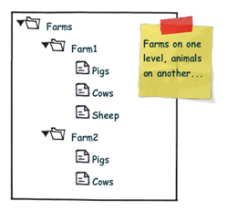
Most WPF TreeView samples you see on the web are somewhat simplistic: While they may provide heterogeneous data, usually all childs of a given node are of the same type:

simpletree

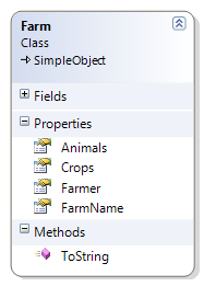
However, more often than not, you’re running into more complex scenarios where additional structuring is necessary. Image your Farm class looks like this:

image

Accordingly, you might want to display that information according to the sketch below:

complextree

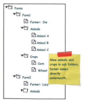
Note the difference: We want to organize the Animals and Crops collections within individual sub folders, while the "Farmer" node is a direct child of the "Farm" root node. From the control’s point of view, this means that the "Folder" nodes and the "Farmer" node are siblings.

Now, one solution to that very problem are ViewModel wrapper classes that optimize the business logic for your specific UI logic. This route does work very well for quite a few scenarios. However, sometimes, you just want to have a quick solution. I’ll try to provide one here…

My solution to that very problem requires the following ingredients:

  • A MultiBinding that allows you to combine different bindings.
  • A converter that helps us organizing the different bound collections into sub folders, where necessary.
  • And of course: Data templates that provide a visual representation of your bound data.


Let’s start with the bindings, which are declared within a HiearchicalDataTemplate. You can use a MultiBinding to retrieve all necessary data of a given Farm instance:


<HierarchicalDataTemplate DataType="{x:Type local:Farm}">

  <!-- bind the different data sources -->
  <HierarchicalDataTemplate.ItemsSource>
    <MultiBinding>
      <Binding Path="Farmer" />
      <Binding Path="Animals" />
      <Binding Path="Crops" />
    </MultiBinding>
  </HierarchicalDataTemplate.ItemsSource>

  <TextBlock Text="{Binding Path=FarmName}" />

</HierarchicalDataTemplate>


A MultiBinding always needs a converter of type IMultiValueConverter. Our converter has to provide the following functionality:

  • Allow binding of simple objects (Farmer), or collections (Animals, Crops).
  • Where necessary, put a bound child item or collection into a virtual container object that can serve as a "folder" when it comes to rendering.
  • Provide means to name (or even identify) a folder in order to simplify styling.
  • Render specific child items directly under the parent node (no subfolder). 
  • Return everything as a an object that can be bound to the TreeView.ItemsSource property.


I wrote a simple converter that performs these tasks. The initial declaration looks like this:

 
<MultiBinding Converter="{StaticResource folderConverter}">
  <Binding Path="Farmer" />
  <Binding Path="Animals" />
  <Binding Path="Crops" />
</MultiBinding>
 
…and it produces the following output:

image


Obviously, the data is being parsed parsed and assigned to the "Farm" nodes, but we’re still lacking the desired structure (sub folders for animals and plants). However, this can easily be done by setting the ConverterParameter property:


<MultiBinding Converter="{StaticResource folderConverter}"
              ConverterParameter=", Animals, Cultivated Plants">
  <Binding Path="Farmer" />
  <Binding Path="Animals" />
  <Binding Path="Crops" />
</MultiBinding>
 

The converter parameter allows you to define folders for any of the items that are bound within the MultiBinding, while an empty string inserts a bound item directly under the root item. The converter parameter above produces the following output:

 image


The tree now renders the farmers and four FolderItem instances. FolderItem is a very simple helper class that is used by the converter to store the bound Animals and Crops collections. It provides just two properties:

  • Name (the string that was defined through the converter parameter)
  • Items (the folder’s contents)

Currently, the tree does not know yet how to render a FolderItem class, which is why there’s just the name displayed. What’s missing here is an additional data template for FolderItem:


<!-- data template for FolderItem instances -->
<HierarchicalDataTemplate DataType="{x:Type vm:FolderItem}"
                          ItemsSource="{Binding Path=Items}">

  <TextBlock Text="{Binding Path=Name}" />

</HierarchicalDataTemplate>


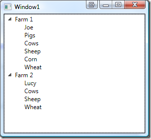
This finally produces our desired output:

image


Simply delegating data organization to the SimpleFolderConverter allows us to individually structure heterogeneous data for our TreeView control with a very simplistic approach. Below is the complete XAML for the sample:


<Window
  x:Class="Hardcodet.Farms.Window1"
  xmlns="http://schemas.microsoft.com/winfx/2006/xaml/presentation"
  xmlns:x="http://schemas.microsoft.com/winfx/2006/xaml"
  xmlns:vm="clr-namespace:Hardcodet.Farms.ViewModel"
  xmlns:local="clr-namespace:Hardcodet.Farms.Model"
  Title="Window1"
  Height="300"
  Width="300">

  <Window.Resources>
    <vm:SimpleFolderConverter x:Key="folderConverter" />

    <!-- data template for Farm instances -->
    <HierarchicalDataTemplate DataType="{x:Type local:Farm}">

      <!-- bind the different data sources -->
      <HierarchicalDataTemplate.ItemsSource>
        <MultiBinding Converter="{StaticResource folderConverter}" 
                      ConverterParameter=", Animals, Cultivated Plants">
          <Binding Path="Farmer" />
          <Binding Path="Animals" />
          <Binding Path="Crops" />
        </MultiBinding>
      </HierarchicalDataTemplate.ItemsSource>

      <TextBlock Text="{Binding Path=FarmName}" />
    </HierarchicalDataTemplate>


    <!-- data template for FolderItem instances -->
    <HierarchicalDataTemplate DataType="{x:Type vm:FolderItem}"
                              ItemsSource="{Binding Path=Items}">
      <TextBlock Text="{Binding Path=Name}" />
    </HierarchicalDataTemplate>

  </Window.Resources>

  <!-- the treeview control -->
  <TreeView x:Name="farmsTree" />
  
</Window>


Of course, you can easily style any of the data templates to your liking. You find the complete sample under the link below. Enjoy 🙂

Download Sample Project (VS2008): farmtree.zip

Author: Categories: WPF, WPF TreeView Tags: ,

WPF TabControl transition effects with Transitionals

May 13th, 2008

Transitionals is a WPF framework that allows you to integrate nice transition effects into your WPF application with very little effort. It’s gone live a few days ago on CodePlex and definitely worth checking out:

http://www.codeplex.com/transitionals


I’ve downloaded the library today in order to incorporate a little eye candy into a prototype I’m doing. However, what I wanted to do was adding transition effects on a tab control, which is currently not supported out of the box by the framework:

Currently Transitionals ships with only two controls out of the box […]. Other controls, like a Tab control for example, could also be created. We encourage the community to come up with other common navigation and presentation scenarios that can leverage transitions.

This sounded like a lot of work, but luckily, it wasn’t: TabControl provides a ContentTemplate property which can be bound to a data template. This is were I put a TransitionElement control and bound it to the current content of the tab control:

<DataTemplate x:Key="TabTemplate">
  <t:TransitionElement Content="{Binding}">
    <!-- some more stuff -->
  </t:TransitionElement>
</DataTemplate>

<!-- tab control with content template -->
<TabControl ContentTemplate="{StaticResource TabTemplate}" />


These bindings take care of everything – a tab switch changes the content of the TransitionElement, which triggers a transition animation. All that was left to do was configuring a transition effect and adding some content to the tab control. Here’s the complete listing that uses a 3D rotation effect:


<Grid>
  <Grid.Resources>

    <!-- the data template binds the content to a transition element -->
    <DataTemplate x:Key="TabTemplate">
      <t:TransitionElement Content="{Binding}">
        <!-- rotate tab contents -->
        <t:TransitionElement.Transition>
          <trans:RotateTransition Duration="0:0:1.500"
                                  Angle="90" />
        </t:TransitionElement.Transition>
      </t:TransitionElement>
    </DataTemplate>

  </Grid.Resources>


  <TabControl ContentTemplate="{StaticResource TabTemplate}">

    <TabItem Header="First">
      <!-- some content -->
    </TabItem>

    <TabItem Header="Second">
     <!-- some content -->
    </TabItem>

  </TabControl>

</Grid>


My sample contains two tabs which both display the same image. Accordingly, the code snippet above produces the following 3D effect when switching tabs:

transition

Author: Categories: WPF, WPF Controls Tags: ,