Archive

Archive for the ‘WPF’ Category

Beginner’s Tutorial: 3D Line and Border Effects in XAML

May 28th, 2009

This mini-tutorial might be for you if you’re having troubles finding the right line colors to achieve simple 3D effects like these:

linesamples


The solution to this very problem is actually pretty simple, and it always takes the same three ingredients:

  • A white line
  • A black line
  • Reduced opacity

Basically, to get an edged line on a green background, you don’t need to fiddle with different shades of green. Just use white and black lines and play with the opacity. Here’s the settings in Blend for one of the white lines in the above screenshot:

highlighted-line-settings


…and this is the corresponding XAML for the two vertical lines:

<Grid Background="Green">  
  <Path Stretch="Fill" Stroke="#5A000000" Margin="25,62,0,0"
        Width="1" Height="100" Data="M130,176 L130,303.03543"/>
  <Path Stretch="Fill" Stroke="#5AFFFFFF" Margin="26,62,0,0"
        Width="1" Height="100" Data="M130,176 L130,303.03543"/>
</Grid>


Tip: Hiding Blend’s Handles

If you’re trying to format a line, Blend’s handles don’t help much, as the basically hide the whole content:

blend-handles

However – you can easily hide / show them by pressing the F9 button.


Tutorial: Creating a 3D Toggle Button Style

Another usage of white and black lines is a 3D effect for borders. Let’s put this to action and create a reusable style that can be applied to a ToggleButton control:

toggle-buttons 

Rather than joining four lines for each button state, I’ll use two Border controls with the same dimensions for each state, taking advantage that the BorderThickness property can be set independently for every edge. Here’s the borders for the unchecked state:

<Grid x:Name="uncheckedState">
  <Border BorderBrush="#49FFFFFF" BorderThickness="1,1,0,0"/>
  <Border BorderBrush="#49000000" BorderThickness="0,0,1,1"/>
</Grid>


…and here’s the borders for the checked state. Note that its Visibility property of the surrounding grid is set to Collapsed in order to hide the borders:

<Grid x:Name="checkedState" Visibility="Collapsed">
  <Border BorderBrush="#49000000" BorderThickness="1,1,0,0"/>
  <Border BorderBrush="#49FFFFFF" BorderThickness="0,0,1,1"/>
</Grid>  


I put these borders together in a simple style, which uses a trigger to switch the visibility of the two borders as soon as the IsChecked property of the ToggleButton changes:

<Style TargetType="{x:Type ToggleButton}">
  <Setter Property="Template">
    <Setter.Value>
      <ControlTemplate TargetType="{x:Type ToggleButton}">
        <Grid x:Name="mainGrid" Margin="0,0,1,1">
                             
          <Grid x:Name="uncheckedState">
            <Border BorderBrush="#49FFFFFF" BorderThickness="1,1,0,0"/>
            <Border BorderBrush="#49000000" BorderThickness="0,0,1,1"/>
          </Grid>
              
          <Grid x:Name="checkedState" Visibility="Collapsed">
            <Border BorderBrush="#49000000" BorderThickness="1,1,0,0"/>
            <Border BorderBrush="#49FFFFFF" BorderThickness="0,0,1,1"/>
          </Grid>   
              
          <!--
            WPF needs a background to toggle IsChecked
            if the ContentPresenter does not fill the whole area
          -->
          <Border Background="#00000000" />
              
          <ContentPresenter VerticalAlignment="Center"
                            HorizontalAlignment="Center" />

        </Grid>
  
        <!-- triggers toggle visual appearance -->
        <ControlTemplate.Triggers>
          <Trigger Property="IsChecked" Value="True">
            <Setter TargetName="checkedState"
                    Property="Visibility"
                    Value="Visible" />
            <Setter TargetName="uncheckedState"
                    Property="Visibility"
                    Value="Collapsed" />
            <Setter TargetName="mainGrid"
                    Property="Margin"
                    Value="1,1,0,0"/>
          </Trigger>
        </ControlTemplate.Triggers>
      </ControlTemplate>
    </Setter.Value>
  </Setter>
</Style>


With the style in place, you can easily declare a ToggleButton like this:

<ToggleButton Width="100" Height="24" Content="hello world" />

Author: Categories: WPF Tags:

WPF NotifyIcon 1.0.1 – Minor Improvements, Major Tutorial

May 15th, 2009

I just posted an upgrade to my WPF NotifyIcon, which adds some minor improvements to the control. The most important one is probably the simplified data binding support for context menus (thanks to Nic Pillinger for the hint), but I also managed to add some polish in a few other areas.


image


Apart from the updated control itself, I completely revamped the sample project. It’s no longer just a showcase but contains various standalone samples which cover all aspects of the control. And last but not least, I published a complementary tutorial on the CodeProject. One could say I was quite busy 😉


Further information and download on the project page:
http://www.hardcodet.net/projects/wpf-notifyicon

Using Attached Events to Trigger Animations in WPF

May 8th, 2009

This is a pattern I applied when implementing the WPF NotifyIcon component in order to provide animation support for popups, tooltips, and balloon messages. The problem I had to solve was the loose coupling between the NotifyIcon and displayed controls:


image

Accordingly, I didn’t know anything about these controls at runtime. Nonetheless, I wanted to provide a communication channel to inform that UIElement that it is being displayed. And I wanted to do it declaratively.

Attached Events to the Rescue

Enter attached events. Just like the better known attached properties, they can be declared in a static class and attached to arbitrary dependency objects. Accordingly, a control X does not need to declare an event itself in order to raise it.

If you are working with Expression Blend, chances are high that you are already using attached events quite often. As an example, the Mouse.MouseDown attached event that lets you trigger an animation if the user clicks on an arbitrary control. And nothing stops you from defining your own custom events 🙂

Creating a Sample Application

Let’s create a simple sample. The scenario is the following:

  • Sometimes, some kind of critical event occurs (simulated through a button click).
  • Every time this happens, we want a “status control” to show an alarm.

We will implement this status control purely in XAML – an attached event will trigger an animation that displays a warning sign:

image


Read more…

Author: Categories: WPF, WPF Controls Tags: , ,

NetDrives 1.0 Released

May 6th, 2009

NetDrives
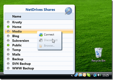
I’ve just uploaded installer and source code of NetDrives 1.0. This is my first tool that does not only address fellow developers, but a wider audience 🙂

In a few words, NetDrives is an open source utility that helps you manage your network shares and mapped network drives. Unlike Windows, it can reconnect to secured shares during startup and provides you quick access to your configured shares.


quickaccess


More information, screenshots, and downloads at the project page:

http://www.hardcodet.net/netdrives

WPF NotifyIcon Released

May 4th, 2009

I’m happy to announce the public release of my WPF NotifyIcon control 🙂

This is an implementation of a NotifyIcon (aka system tray icon or taskbar icon) for the WPF platform. It does not just rely on the existing Windows Forms component, but is a purely independent control which leverages several features of the WPF framework in order to display rich ToolTips, Popups, context menus, and balloon messages.


image


I’m planning on doing an introductory article on CodeProject (well, somewhere along the way…) but you’ll probably get along just fine – the control comes with a sample application that shows off most of the control’s features.


Further information and download on the project page:
http://www.hardcodet.net/projects/wpf-notifyicon


kick it on DotNetKicks.com

Declaring Custom WPF Commands via MarkupExtensions

April 25th, 2009

And yet another markup extension that hopefully makes things a little easier for you. Basically, it’s the same pattern that the good doctor described here for value converters, but with custom commands in mind.

Without Extension

Basically, this extension makes your commands immediately available without having to declare them. One "traditional" way to declare a command is directly in XAML:

<Window.Resources>

  <cmd:HelloWorldCommand x:Key="SayHello" />

</Window.Resources>


…and then apply it like this:

<Button Command="{StaticResource SayHello}" />


Using the Markup Extension

The declaration part above can become somewhat tedious, especially if you have quite a few commands (e.g. because you are using a ribbon with lots of buttons on it). Thanks to using a markup extension, you can skip the declaration part altogether and just declare your command.

<Button Command="{cmd:HelloWorldCommand}" />


Implementation and Sample


/// <summary>
/// Basic implementation of the <see cref="ICommand"/>
/// interface, which is also accessible as a markup
/// extension.
/// </summary>
public abstract class CommandExtension<T> : MarkupExtension, ICommand
    where T:class, ICommand, new()
{
  /// <summary>
  /// A singleton instance.
  /// </summary>
  private static T command;


  /// <summary>
  /// Gets a shared command instance.
  /// </summary>
  public override object ProvideValue(IServiceProvider serviceProvider)
  {
    if (command == null) command = new T();
    return command;
  }


  /// <summary>
  /// Fires when changes occur that affect whether
  /// or not the command should execute.
  /// </summary>
  public event EventHandler CanExecuteChanged
  {
    add { CommandManager.RequerySuggested += value; }
    remove { CommandManager.RequerySuggested -= value; }
  }
  

  /// <summary>
  /// Defines the method to be called when the command is invoked.
  /// </summary>
  /// <param name="parameter">Data used by the command.
  /// If the command does not require data to be passed,
  /// this object can be set to null.
  /// </param>
  public abstract void Execute(object parameter);


  /// <summary>
  /// Defines the method that determines whether the command
  /// can execute in its current state.
  /// </summary>
  /// <returns>
  /// This default implementation always returns true.
  /// </returns>
  /// <param name="parameter">Data used by the command.  
  /// If the command does not require data to be passed,
  /// this object can be set to null.
  /// </param>
  public virtual bool CanExecute(object parameter)
  {
    return true;
  }
}


…and here’s a sample implementation:

public class HelloWorldCommand : CommandExtension<HelloWorldCommand>
{
  public override void Execute(object parameter)
  {
    MessageBox.Show("Hello world.");
  }
}


Of course, nothing prevents you from pimping the base class a little to your needs 🙂

Author: Categories: WPF Tags: ,