Archive

Author Archive

(Enterprise Validation Block, Interfaces) => BIG Trouble

January 8th, 2009

I had a first look at Microsoft’s Enterprise Validation Block 4.1 today and trashed it before I even got really started. The reason: The thing doesn’t really support OO-architectures that rely on interfaces / polymorphism.


I ran my test with this simple interface / implementation:

public interface IModel
{
  [StringLengthValidator(1, 5, MessageTemplate = "First rule failed.")]
  string First { get; set; }

  [StringLengthValidator(1, 5, MessageTemplate = "Second rule failed.")]
  string Second { get; set; }

  [StringLengthValidator(1, 5, MessageTemplate = "Third rule failed.")]
  string Third { get; set; }
}

public class Model : IModel
{
  public string First { get; set; }

  public string Second { get; set; }

  public string Third { get; set; }
}
 

Now look at this test:

public void Test()
{
  Model model = new Model();

  var result = Validation.Validate(model);
  foreach (var validationResult in result)
  {
    Console.Out.WriteLine(validationResult.Message);
  }
}


The code above won’t output a single validation error, because it only checks the Model class for validation attributes. And there are none – the rules have been declared in the IModel interface. My bad.
The code below, on the other hand, works. Notice that the model variable is declared using the interface type:

public void Test()
{
  IModel model = new Model();

  var result = Validation.Validate(model);
  foreach (var validationResult in result)
  {
    Console.Out.WriteLine(validationResult.Message);
  }
}


Now, it gets really ugly when you’re having attributes at different places. After this initial test, I moved the third validation rule into the implementing Model class and removed the Third property from the interface:

public interface IModel
{
  [StringLengthValidator(1, 5, MessageTemplate = "First rule failed.")]
  string First { get; set; }

  [StringLengthValidator(1, 5, MessageTemplate = "Second rule failed.")]
  string Second { get; set; }
}

public class Model : IModel
{
  public string First { get; set; }

  public string Second { get; set; }

  [StringLengthValidator(1, 5, MessageTemplate = "Third rule failed.")]
  public string Third { get; set; }
}


As a result, validating for the IModel interface returns two validation errors, and validating for the Model class reports a single error for the third rule. Now think about handling scenarios where your class implements several interfaces that may provide validation rules. Ouch.


Support for inheritance was the absolute first thing I tested. Frankly, it is beyond me how this library could make it into production over a year ago with this kind of behavior.

This not only promotes bad design, it’s also dangerous as hell because refactoring silently breaks your validation.
Author: Categories: C# Tags:

Combining WPF Validation Rules and IDataErrorInfo to Resolve Conversion Errors

January 8th, 2009

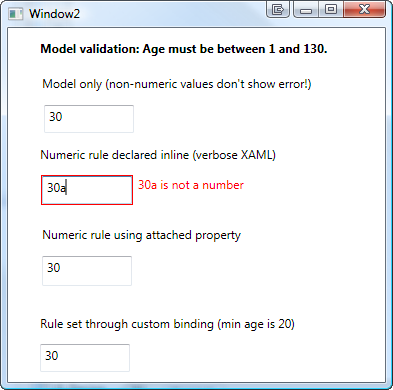
This article discusses a few approaches to overcome binding conversion errors in WPF by combining model validation (through IDataErrorInfo) and WPF validation rules. Practically, I’m going to outline three approaches to the same solution:

  • Inline declaration
  • Using attached properties
  • Using custom binding classes


image

The Problem

WPF validation through IDataErrorInfo is a great feature if you already have validation logic in you model. However: There is a problem if the user enters a value that cannot be written to model due to value conversion errors. Let’s start with a simple sample:

  • A TextBox is bound to a numeric Age property of your model.
  • As soon as the user enters a value in the Textbox, the property on the model is updated. The model then validates whether the entered value is valid (range from 1 to 130 years).
  • However: If the user enters a string rather than a number (e.g. “30a”), the value conversion to an integer fails. In this case, WPF does not show an error at all:

image


Karl Shifflet recently updated his article on this very subject, where he outlines an MVVM-based approach to the problem (highly recommended reading material!).

In my case, however, I was looking for a simpler solution. I had validation and views already in place and just wanted a visual representation of invalid input that cannot be bound to the model.


WPF Validation Rules to the Rescue

And this is where the good old WPF Validation Rules come back into play:

  1. A binding with ValidatesOnDataErrors=True ensures that the model validation logic is being invoked.
  2. Additional WPF Validation Rules take care of invalid input that can not be bound to the model.


<TextBox x:Name="txtAge">
  
  <TextBox.Text>
    <Binding Path="Age" ValidatesOnDataErrors="True">
      <Binding.ValidationRules>
        <rules:NumericRule />
      </Binding.ValidationRules>
    </Binding>
  </TextBox.Text>

</TextBox>


That’s it already! An invalid numeric value (below minimum, above maximum) is handled by the model, everything else is caught be the NumericRule (see attached sample for the sources).

image


Simplify Markup 1: Attached Properties

The above sample has one catch – it forces me to write rather verbose XAML. This is where attached properties come to the rescue. Here’s the same thing using an attached property:


<TextBox x:Name="txtAge"
  Text="{Binding Path=Age, ValidatesOnDataErrors=True}"
  rules:Editors.TextRule="{StaticResource numericRule}"  
/>


In the sample above, I declared an attached property of type ValidationRule that points to by custom rule. However, depending on your case, you can make your attached property as simple/complex as you need. A great article on this subject was published by WPF master Josh Smith on CodeProject, where he outlines this exact pattern.


Simplify Markup 2: Custom Binding Classes

As an alternative to attached properties – especially in case you want to define multiple parameters – a custom binding expression might be a simpler approach. If you use a simple Decorator helper class, creating your custom binding class is a breeze:


<TextBox x:Name="txtCustomBinding"
  Text="{local:RuleBinding Path=Age, MinValueOverride=20}"
/>


Here’s my custom binding class, derived from BindingDecoratorBase:

using System;
using System.Windows.Controls;
using System.Windows.Data;
using Hardcodet.Wpf.ValidationRules;

namespace Hardcodet.Wpf.CustomBinding
{
  /// <summary>
  /// A binding extension that checks for a given
  /// numeric value.
  /// </summary>
  public class RuleBinding : BindingDecoratorBase
  {
    /// <summary>
    /// An optional override for the minimum value,
    /// that can be used to narrow the allowed range.
    /// </summary>
    public int? MinValueOverride { get; set; }


    /// <summary>
    /// Creates a new instance of the binding with default values.
    /// </summary>
    public RuleBinding()
    {
      //set default binding directives
      ValidatesOnDataErrors = true;
      UpdateSourceTrigger = UpdateSourceTrigger.PropertyChanged;
    }


    /// <summary>
    /// This method is being invoked during initialization.
    /// </summary>
    /// <param name="provider">Provides access to the bound items.</param>
    /// <returns>The binding expression that is created by
    /// the base class.</returns>
    public override object ProvideValue(IServiceProvider provider)
    {
      //create the validation rule
      ValidationRule rule;
      if (MinValueOverride.HasValue)
      {
        //create a rule that also narrows the minimum value
        rule = new MinNumericRule() {MinValue = MinValueOverride.Value};
      }
      else
      {
        //just make sure the value is numeric
        rule = new NumericRule();
      }

      Binding.ValidationRules.Add(rule);

      //delegate binding creation etc. to the base class
      object val = base.ProvideValue(provider);
      return val;
    }
  }
}


The attached sample shows you all the techniques I described above.

Download sample project: validationrules.zip

kick it on DotNetKicks.com

Author: Categories: Uncategorized Tags: ,

Using Attached Properties to Create a WPF Image Button

January 7th, 2009

Today I came across a nice blog post that described how to create a WPF image button with three different approaches. I’ve always taken an alternative route using attached properties, so here’s a short tutorial that complement’s the techniques outlined on Max’ Blog:


 image


Basically, the work to get there consists of two parts:

  • Declare an attached property that gets an image source.
  • Create a style (or multiple styles) that makes use of the attached property in order to display the image.


Attached Property

There’s nothing special here – I just declared an attached property named Image, which is of type ImageSource.


using System.Windows;
using System.Windows.Media;

namespace Hardcodet.Wpf.Util
{
  public class EyeCandy
  {
    #region Image dependency property

    /// <summary>
    /// An attached dependency property which provides an
    /// <see cref="ImageSource" /> for arbitrary WPF elements.
    /// </summary>
    public static readonly DependencyProperty ImageProperty;

    /// <summary>
    /// Gets the <see cref="ImageProperty"/> for a given
    /// <see cref="DependencyObject"/>, which provides an
    /// <see cref="ImageSource" /> for arbitrary WPF elements.
    /// </summary>
    public static ImageSource GetImage(DependencyObject obj)
    {
      return (ImageSource) obj.GetValue(ImageProperty);
    }

    /// <summary>
    /// Sets the attached <see cref="ImageProperty"/> for a given
    /// <see cref="DependencyObject"/>, which provides an
    /// <see cref="ImageSource" /> for arbitrary WPF elements.
    /// </summary>
    public static void SetImage(DependencyObject obj, ImageSource value)
    {
      obj.SetValue(ImageProperty, value);
    }

    #endregion

    static EyeCandy()
    {
      //register attached dependency property
      var metadata = new FrameworkPropertyMetadata((ImageSource) null);
      ImageProperty = DependencyProperty.RegisterAttached("Image",
                                                          typeof (ImageSource),
                                                          typeof (EyeCandy), metadata);
    }
  }
}


Property Declaration

Once this is done, you can attach the property to arbitrary items. I want to enhance a standard WPF button, so my XAML looks like this:

<Window
  x:Class="Hardcodet.Wpf.Util.Window1"
  xmlns="http://schemas.microsoft.com/winfx/2006/xaml/presentation"
  xmlns:x="http://schemas.microsoft.com/winfx/2006/xaml"
  xmlns:local="clr-namespace:Hardcodet.Wpf.Util">
  <Grid>
    
    <!-- declare a button with an attached image -->
    <Button
      Content="OK"
      local:EyeCandy.Image="Ok.png" />
    
  </Grid>
</Window>


Providing a Button Style

However, just setting the attached property doesn’t change anything at all. This is no surprise: After all, the button does not know what to do with the attached image. Yet 🙂

This is were styles come into play. Here’s the button style I used for this sample:


<!--  A button style that displays an attached image -->
<Style
  x:Key="ImageButton"
  TargetType="{x:Type Button}">
  <Setter
    Property="HorizontalContentAlignment"
    Value="Stretch" />
  <Setter
    Property="ContentTemplate">
    <Setter.Value>
      <DataTemplate>
        <Grid>
          <Image
            Source="{Binding Path=(local:EyeCandy.Image),
                     RelativeSource={RelativeSource FindAncestor,
                       AncestorType={x:Type Button}}}"
            HorizontalAlignment="Left"
            Margin="8,0,0,0"
            Height="16"
            Width="16" />
          <TextBlock
            Text="{TemplateBinding Content}"
            HorizontalAlignment="Center" />
        </Grid>
      </DataTemplate>
    </Setter.Value>
  </Setter>
</Style>


A I explicitly named the style, the last step is to assign the style to the button:

<!-- declare a button with an attached image -->
<Button
  Content="OK"
  local:EyeCandy.Image="Ok.png"
  Style="{DynamicResource ImageButton}"
  />


Note that you are not limited to the standard WPF button class. Once the attached property is declared, you can attach an image to whatever control you like. All you have to do is just writing another style. You gotta love WPF 🙂


Blend Design Time Support

Blend fully supports attached properties. However, it might take one or two restarts.

image


Conclusion

User Controls are great, especially if want to create composite controls and provide multiple binding points. However, for simple customization, I still prefer the attached property approach over writing custom controls:

  • Apart from the property declaration, everything else is pure XAML.
  • I can style whatever control I like: Commercial 3rd party controls, tab headers, borders etc. without having to create new controls or even write code. All I have to do is create a new style.
  • Its fully up to the designer how to style controls one the properties have been declared. And I can even write multiple styles for the same control type in order to provide a different look and feel for a given control.


Sample Project: imagebuttons.zip

kick it on DotNetKicks.com

Author: Categories: WPF Controls Tags: ,

Lambda Dependencies Update

December 30th, 2008

I just uploaded an update of my Lambda Dependencies library which fixes a bug with the weak event proxy. The update contains the fix and some minor optimizations.

Lambda Dependencies 1.0.1: dependencies.zip

Author: Categories: Dependencies Tags:

Microsoft WPF DataGrid vs. Commercial Solution: 1:0

December 30th, 2008

I’ve never been really happy with the commercial data grid I’ve been using so far – the whole API felt somewhat “winformish”, and required my to write a lot of XAML or even code for even the most basic tasks.

Today, I needed a simple grid on one of my current projects, and immediately got annoyed by the same issues that bug me every time. With the difference that this time, I had a new alternative to look at – Microsoft’s Data Grid that went V1 this October.

Well: This is an amazing control. It’s not amazingly powerful, it doesn’t have amazing animations, amazing views or anything like that. There is just one thing: It gets the job done.

Here’s my top 3 in comparison to my commercial product:

1: Data Binding

Finally I have data binding the way I always thought it should be. No more dealing with the internal data representation of the grid, and 2-way-data binding to selected items (not records or rows) out of the box. I didn’t even have to look up the API – it’s just as I expected it to be. Loving it:


<dg:DataGrid
  x:Name="platforms"
  ItemsSource="{Binding Path=Track.Platforms, ElementName=me}"
  SelectedItem="{Binding Path=ActivePlatform, ElementName=me}">

<!-- column definitions -->

</dg:DataGrid>


2: Liquid (Star-Sized) Columns

To my great surprise, I can easily star-size columns to take the full available horizontal space of the grid. This is a feature I need as good as every time I use a grid. With my commercial product, I was forced to write a whole layout template in order to get there. Not anymore:


<dg:DataGrid.Columns>
  <!-- fixed size column -->
  <dg:DataGridTextColumn
    Header="Name"
    Width="60" 
    Binding="{Binding Path=ItemName}" />
  <!-- takes 2/3 of the remaining space -->
  <dg:DataGridTextColumn
    Header="Description"
    Width="2*"
    Binding="{Binding Path=Description}" />
  <!-- takes 1/3 of the remaining space -->
  <dg:DataGridTextColumn
    Header="Position"
    Width="*"
    Binding="{Binding Path=StartPosition}" />
</dg:DataGrid.Columns>


3: Styling

I really do like some of the carefully crafted themes of my commercial grid. But on the other hand, customizing it was a major pain, so styling was one of my main concerns. However, the MS grid is amazingly flexible and easy to use for a v1.0 solution.

In the end, I’m happier with my custom-styled result than the predefined theme of my commercial grid – simply because the custom style blends in perfectly with the rest of the UI:

styledgrid

checklist


Conclusion

I’m pretty sure that the commercial – and definitely more powerful – solutions have their rightful place on the market, but Microsoft’s grid really fills a gap for me here – especially because of the API that just keeps things simple.

I can’t help but think that the vendors that were the first ones on the market may be last in the long run. At least the API of the grid I used so far just doesn’t cut it for me. We all had to get (are still getting) acquainted to “thinking in WPF” and some of the “mature” solutions just give me the impression that their basic concepts have “Windows Forms” written all over them. And with regards to compatibility, it might get pretty hard to get rid of that. That is, however, just my 0.02$.

Go get it @ CodePlex: http://www.codeplex.com/wpf

Author: Categories: DataGrid, Open Source, WPF, WPF Controls Tags: ,

Tracking Inter-Object Dependencies using Expression Trees (Part 2)

December 28th, 2008

This is the second part of an article that covers the usage of lambda expressions to monitor changes on complex object graphs. The first part can be found here and the third part (Lambda Binding) is here.

Latest Version: 1.0.3, 2009.04.03
Download Project: lambda-dependencies.zip

Introduction


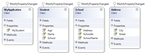
The first part covered the basics of the framework based on a sample application where I monitored any changes on the object graph MyStudent.School.Address.City with a simple lambda expression:

public MyApplication()
{
  //create a dependency on the city of the student's school
  var dep = DependencyNode.Create(() => MyStudent.School.Address.City);
}


The subsequent chapters discuss a few advanced topics that might be important when working with the API.


INotifyPropertyChanged vs. Manual Updates

In order to pick up a changed values on the dependency chain, the observed classes (in the sample: School, Student, Address) must implement the INotifyPropertyChanged interface. Otherwise, changes remain undetected.

This might not be a problem in case of immutable properties or fields, and it is perfectly valid to include classes that do not implement the interface. However: In case you don’t have INotifyPropertyChanged available (e.g. because you rely on a class in an external library), and changes do occur, you can manually update these node values by invoking the SetNodeValue method of an arbitrary dependency node.

public void SetFieldDependency()
{
  Student student = TestUtil.CreateTestStudent();

  //create dependency on the address field rather than the Address property
  var dep = DependencyNode.Create(() => student.School.address.City);
  dep.DependencyChanged +=
      (node, e) => Console.WriteLine("City: " + e.TryGetLeafValue());

  //exchange address
  var newAddress = new Address {City = "Stockholm"};
  student.School.address = newAddress;

  //get the node that represents the address
  var addressFieldNode = dep.FindNode(() => student.School.address);

  //set the node value manually and trigger change event
  addressFieldNode.SetNodeValue(newAddress, true);
}


Reacting to Sub Property and Target Collection Changes

In the sample above, we declared a dependency on the City property of an Address object. City is just a string, but what if we wanted to track *any* change on the school’s address? One way would be to declare dependencies for every single property of the address:

var student = TestUtil.CreateTestStudent("Harvard");

//create dependency on City
var dep1 = DependencyNode.Create(() => student.School.Address.City);
//create dependency on Street
var dep2 = DependencyNode.Create(() => student.School.Address.Street);
//...


This, however, is pretty tedious and there is a simpler solution: As Address implements INotifyPropertyChanged, we can just declare a dependency on the Address property of School.

var student = TestUtil.CreateTestStudent("Harvard");

//create dependency on address object
var dep1 = DependencyNode.Create(() => student.School.Address);

//output the changed property name and the change reason
dep1.DependencyChanged += (node, e) =>
      {
        string msg = "Changed property: {0}, change reason: {1}";
        Console.Out.WriteLine(msg, e.ChangedMemberName, e.Reason);
      };

//change the city
student.School.Address.City = "Ethon";


The above snippet registers with the DependencyChanged event and writes two properties of the event’s DependencyChangeEventArgs to the console: ChangedMemberName and the Reason. This produces the following console output:

Changed property: City, change reason: SubPropertyChanged


Note that this is a special case: The declared dependency chain is Student:School:Address while we received a change event for the City property, which is not part of the dependency chain!

I think that usually, this is a desired behavior, so this is the default. However, you can control this behavior by using a DependencyNodeSettings class and explicitly setting the ObserveSubValueChanges property:

var student = TestUtil.CreateTestStudent("Harvard");

//create settings class
var settings = new DependencyNodeSettings<Address>(() => student.School.Address);
settings.ChangeHandler = OnDependencyChanged;

//configure settings to ignore sub item changes
settings.ObserveSubValueChanges = false;

//does not cause a change event:
Student.School.Address.City = "Ethon";


Note that the same behavior goes for target items that are collections. If the target collection implements the INotifiyCollectionChanged interface, the dependency node fires the DependencyChanged event with a reason of TargetCollectionChange as soon as the contents of the targeted collection changes.

Weak References (and Deserved Credits)

A DependencyNode only maintains weak references. Even if it would not pick up an object that goes out of scope because no property change event was fired, this still wouldn’t stop the targeted object from being garbage collected. The same goes for node’s events and internal event listeners.

I’m using two very nice implementations for internal listeners and the exposed DependencyChanged event:


Limitations

This library solves a specific problem and currently operates solely on members, variables, and constant expressions – more complex expressions (such as LINQ queries) are currently out of the picture, but I’m open to suggestions. You might also look out for related projects, such as Bindable LINQ.

Author: Categories: C#, Dependencies Tags: ,