Archive

Archive for 2009

Combining WPF Validation Rules and IDataErrorInfo to Resolve Conversion Errors

January 8th, 2009

This article discusses a few approaches to overcome binding conversion errors in WPF by combining model validation (through IDataErrorInfo) and WPF validation rules. Practically, I’m going to outline three approaches to the same solution:

  • Inline declaration
  • Using attached properties
  • Using custom binding classes


image

The Problem

WPF validation through IDataErrorInfo is a great feature if you already have validation logic in you model. However: There is a problem if the user enters a value that cannot be written to model due to value conversion errors. Let’s start with a simple sample:

  • A TextBox is bound to a numeric Age property of your model.
  • As soon as the user enters a value in the Textbox, the property on the model is updated. The model then validates whether the entered value is valid (range from 1 to 130 years).
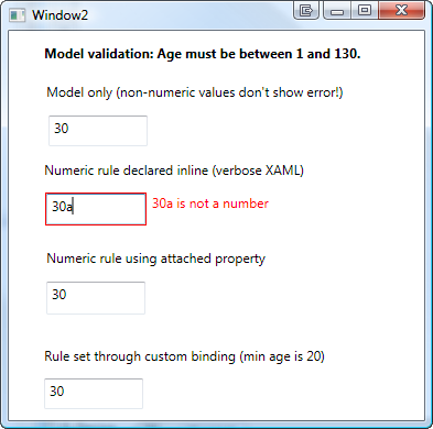
  • However: If the user enters a string rather than a number (e.g. “30a”), the value conversion to an integer fails. In this case, WPF does not show an error at all:

image


Karl Shifflet recently updated his article on this very subject, where he outlines an MVVM-based approach to the problem (highly recommended reading material!).

In my case, however, I was looking for a simpler solution. I had validation and views already in place and just wanted a visual representation of invalid input that cannot be bound to the model.


WPF Validation Rules to the Rescue

And this is where the good old WPF Validation Rules come back into play:

  1. A binding with ValidatesOnDataErrors=True ensures that the model validation logic is being invoked.
  2. Additional WPF Validation Rules take care of invalid input that can not be bound to the model.


<TextBox x:Name="txtAge">
  
  <TextBox.Text>
    <Binding Path="Age" ValidatesOnDataErrors="True">
      <Binding.ValidationRules>
        <rules:NumericRule />
      </Binding.ValidationRules>
    </Binding>
  </TextBox.Text>

</TextBox>


That’s it already! An invalid numeric value (below minimum, above maximum) is handled by the model, everything else is caught be the NumericRule (see attached sample for the sources).

image


Simplify Markup 1: Attached Properties

The above sample has one catch – it forces me to write rather verbose XAML. This is where attached properties come to the rescue. Here’s the same thing using an attached property:


<TextBox x:Name="txtAge"
  Text="{Binding Path=Age, ValidatesOnDataErrors=True}"
  rules:Editors.TextRule="{StaticResource numericRule}"  
/>


In the sample above, I declared an attached property of type ValidationRule that points to by custom rule. However, depending on your case, you can make your attached property as simple/complex as you need. A great article on this subject was published by WPF master Josh Smith on CodeProject, where he outlines this exact pattern.


Simplify Markup 2: Custom Binding Classes

As an alternative to attached properties – especially in case you want to define multiple parameters – a custom binding expression might be a simpler approach. If you use a simple Decorator helper class, creating your custom binding class is a breeze:


<TextBox x:Name="txtCustomBinding"
  Text="{local:RuleBinding Path=Age, MinValueOverride=20}"
/>


Here’s my custom binding class, derived from BindingDecoratorBase:

using System;
using System.Windows.Controls;
using System.Windows.Data;
using Hardcodet.Wpf.ValidationRules;

namespace Hardcodet.Wpf.CustomBinding
{
  /// <summary>
  /// A binding extension that checks for a given
  /// numeric value.
  /// </summary>
  public class RuleBinding : BindingDecoratorBase
  {
    /// <summary>
    /// An optional override for the minimum value,
    /// that can be used to narrow the allowed range.
    /// </summary>
    public int? MinValueOverride { get; set; }


    /// <summary>
    /// Creates a new instance of the binding with default values.
    /// </summary>
    public RuleBinding()
    {
      //set default binding directives
      ValidatesOnDataErrors = true;
      UpdateSourceTrigger = UpdateSourceTrigger.PropertyChanged;
    }


    /// <summary>
    /// This method is being invoked during initialization.
    /// </summary>
    /// <param name="provider">Provides access to the bound items.</param>
    /// <returns>The binding expression that is created by
    /// the base class.</returns>
    public override object ProvideValue(IServiceProvider provider)
    {
      //create the validation rule
      ValidationRule rule;
      if (MinValueOverride.HasValue)
      {
        //create a rule that also narrows the minimum value
        rule = new MinNumericRule() {MinValue = MinValueOverride.Value};
      }
      else
      {
        //just make sure the value is numeric
        rule = new NumericRule();
      }

      Binding.ValidationRules.Add(rule);

      //delegate binding creation etc. to the base class
      object val = base.ProvideValue(provider);
      return val;
    }
  }
}


The attached sample shows you all the techniques I described above.

Download sample project: validationrules.zip

kick it on DotNetKicks.com

Author: Categories: Uncategorized Tags: ,

Using Attached Properties to Create a WPF Image Button

January 7th, 2009

Today I came across a nice blog post that described how to create a WPF image button with three different approaches. I’ve always taken an alternative route using attached properties, so here’s a short tutorial that complement’s the techniques outlined on Max’ Blog:


 image


Basically, the work to get there consists of two parts:

  • Declare an attached property that gets an image source.
  • Create a style (or multiple styles) that makes use of the attached property in order to display the image.


Attached Property

There’s nothing special here – I just declared an attached property named Image, which is of type ImageSource.


using System.Windows;
using System.Windows.Media;

namespace Hardcodet.Wpf.Util
{
  public class EyeCandy
  {
    #region Image dependency property

    /// <summary>
    /// An attached dependency property which provides an
    /// <see cref="ImageSource" /> for arbitrary WPF elements.
    /// </summary>
    public static readonly DependencyProperty ImageProperty;

    /// <summary>
    /// Gets the <see cref="ImageProperty"/> for a given
    /// <see cref="DependencyObject"/>, which provides an
    /// <see cref="ImageSource" /> for arbitrary WPF elements.
    /// </summary>
    public static ImageSource GetImage(DependencyObject obj)
    {
      return (ImageSource) obj.GetValue(ImageProperty);
    }

    /// <summary>
    /// Sets the attached <see cref="ImageProperty"/> for a given
    /// <see cref="DependencyObject"/>, which provides an
    /// <see cref="ImageSource" /> for arbitrary WPF elements.
    /// </summary>
    public static void SetImage(DependencyObject obj, ImageSource value)
    {
      obj.SetValue(ImageProperty, value);
    }

    #endregion

    static EyeCandy()
    {
      //register attached dependency property
      var metadata = new FrameworkPropertyMetadata((ImageSource) null);
      ImageProperty = DependencyProperty.RegisterAttached("Image",
                                                          typeof (ImageSource),
                                                          typeof (EyeCandy), metadata);
    }
  }
}


Property Declaration

Once this is done, you can attach the property to arbitrary items. I want to enhance a standard WPF button, so my XAML looks like this:

<Window
  x:Class="Hardcodet.Wpf.Util.Window1"
  xmlns="http://schemas.microsoft.com/winfx/2006/xaml/presentation"
  xmlns:x="http://schemas.microsoft.com/winfx/2006/xaml"
  xmlns:local="clr-namespace:Hardcodet.Wpf.Util">
  <Grid>
    
    <!-- declare a button with an attached image -->
    <Button
      Content="OK"
      local:EyeCandy.Image="Ok.png" />
    
  </Grid>
</Window>


Providing a Button Style

However, just setting the attached property doesn’t change anything at all. This is no surprise: After all, the button does not know what to do with the attached image. Yet 🙂

This is were styles come into play. Here’s the button style I used for this sample:


<!--  A button style that displays an attached image -->
<Style
  x:Key="ImageButton"
  TargetType="{x:Type Button}">
  <Setter
    Property="HorizontalContentAlignment"
    Value="Stretch" />
  <Setter
    Property="ContentTemplate">
    <Setter.Value>
      <DataTemplate>
        <Grid>
          <Image
            Source="{Binding Path=(local:EyeCandy.Image),
                     RelativeSource={RelativeSource FindAncestor,
                       AncestorType={x:Type Button}}}"
            HorizontalAlignment="Left"
            Margin="8,0,0,0"
            Height="16"
            Width="16" />
          <TextBlock
            Text="{TemplateBinding Content}"
            HorizontalAlignment="Center" />
        </Grid>
      </DataTemplate>
    </Setter.Value>
  </Setter>
</Style>


A I explicitly named the style, the last step is to assign the style to the button:

<!-- declare a button with an attached image -->
<Button
  Content="OK"
  local:EyeCandy.Image="Ok.png"
  Style="{DynamicResource ImageButton}"
  />


Note that you are not limited to the standard WPF button class. Once the attached property is declared, you can attach an image to whatever control you like. All you have to do is just writing another style. You gotta love WPF 🙂


Blend Design Time Support

Blend fully supports attached properties. However, it might take one or two restarts.

image


Conclusion

User Controls are great, especially if want to create composite controls and provide multiple binding points. However, for simple customization, I still prefer the attached property approach over writing custom controls:

  • Apart from the property declaration, everything else is pure XAML.
  • I can style whatever control I like: Commercial 3rd party controls, tab headers, borders etc. without having to create new controls or even write code. All I have to do is create a new style.
  • Its fully up to the designer how to style controls one the properties have been declared. And I can even write multiple styles for the same control type in order to provide a different look and feel for a given control.


Sample Project: imagebuttons.zip

kick it on DotNetKicks.com

Author: Categories: WPF Controls Tags: ,